Thursday, October 18, 2012

From QMA

 I saw a lot arts work on Friday's Queens museum of art trip. I will choose 2 works to write about today. First , a paint" The three sister" by Amos Ferguson.  When I saw that I was caught  by those three yellow mermaid. That is the (Focal Point) why I pay attention on it. They all are stand on the top of  (Unity)stone. Although there are 3, but they are(Variety). First one has a fat waist, second has a waist close to a normal, and last one has  skinny waist.  Second, there are a lot (repetition) of fishes around them.  Also, they have( pattern) rectangles made up their tail. In addition, as a viewer I think this paint is on a brisk (rhythm), because I feel those fishes are move around with happy mood, and this three mermaid are dance on the stone. Seems they are celebrate the sea are peaceful, and all animals live in the sea can have a quiet living environment.
Other work is a paint" Cuban Carnival" by Rene Portocarrero. The( Emphasis) I was looked on it was ( Variety) shape of triangles (repetition) on that paint. They are short , long ,wide, small.  Also (Lines) make many triangles connect together. This paint is colorful on( Primary color, yellow, red, blue) and( Secondary color, such as green, orange). they are all show on the triangles, circles, and different shapes. As you can see the(Balance) are absolute show on this paint. Triangles show balance on a stable way. As a viewer since I seen this paint I feel it is on the lively (Rhythm). Seems they are celebrate something. Feel  very at joy mood. Compare this two paints. They both are show on happy ambience. Second paint is colorful than first, and first paint feel more dynamic than second.

Tuesday, October 16, 2012

"Paisaje de Lluvia" & "Mermaid"


“Paisaje de lluvia (Rainy Landscape)” by Dario Suro is the first piece I will describe. This caught my attention because of the coloring which is very natural and realistic. This painting is very monochromatic but not because he envisioned it this way, but because in this part of nature green is a much empowered color and the different shades of it. In this painting you visibly see the implied wind, due to the way the artist painted the leaves and rain direction. The rain falling in much quantity towards the bottom right of the picture shows diagonal fierce lines.  Aside from the raindrops being lines, they show pattern (rhyme and rhythm) through out the painting. The implied texture of this scenery is wet, windy, and sunless. From the colors chosen for the negative spacing, you can see it is probably cold out, but being nature, a wonderful day, maybe even waited from a rain drought, giving a reason for so much rain. The lighting is complex to explain, but I would say it is bright enough to see a pathway, rather it being much darker and foggy. Suro probably drew this painting out of emotion, or life experience.
“Mermaid” by Rigaud Benoit is the second piece of my choosing. Coming across this painting the one question I asked about it, made it clear, that it was a painting with much to say. I want to know why he placed the mermaid on a canoe, and not inside/above the water, being a mermaid. As soon as you look at the painting your attention is brought to the mermaid and what she holds out with her right arm diagonally upwards (Focal Point). The mermaid is placed in the middle of the painting as well as the middle of the canoe. There are two separated ice bergs on the right and left side of her, also having an even amount of fishes swimming around her giving it a quite clear vision of balance.  There is both unity and variety in this painting because the unity that brings it together is the amount of sea creatures making it known that they are the main attraction. Within these sea creatures including the mermaid, they are varied; no fish is the same in visible texture, size, color, shape, and etc. The lighting shows a beautiful summer day in the middle of the ocean somewhere mystical, with a sense of victory and union. Benoit’s interpretation on his painting would be very interesting to hear in my opinion.

Monday, October 15, 2012

Field Trip


On our trip Friday to the Queens Museum of Art I found lickings of two relatively similar yet different pieces of art.  (Above) The Panorama of The City of New York, Built by Robert Moses for the 1964 world's fair.  This 9,335 square foot architectural model includes every single building constructed before 1992 in all five boroughs; that is a total of 895,000 individual structures.  This sculpture replicates the area of the five burrows of New York, Drawing most of the attention to the Manhattan section where most of the buildings stand out compared to surrounding areas where houses are near ground level.  My attention also moved to the area represented by "Queens" where the airport would have been located.  A small model airplane traveling across a string coming down to the earth and back up in a never ending cycle.  The art is a 3D style with a lot of negative space.  The color pattern ranges to all spectrum's of the rainbow grasping the color of everything in the state.  

The second art that I chose to look at happened to be a similar model of new york, just in a different manor.  The Waterfront sculpture of New York.  (I lost the actual name of the work,)  This sculpture has the geographical aspect of New York, and each district in which the water flows.  Unlike the Panorama, This sculpture is smaller in size, and is a lot less interesting to me.  It's almost all the same color of a dusty orange with the exception of some blue water symbol traveling through the near center of the map.  There are no buildings on this sculpture, how ever there is a mountain range that could represent the upstate region in my assumption.  the 3D artwork comes forth and grabs my attention.  

Friday, October 12, 2012

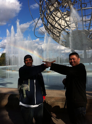
Queens Museum Trip! 10/12/12

What a classy class we are!

"Oh yeah, I know the shortest way back to the 7 train."
(complete with the rainbow!!)

fenglei


A Taste for Opulence

Sèvres Porcelain from the Collection

February 21, 2006–February 25, 2007


Taste of Opulence


Unity: the two vase are exact the same.
Repetition: the elephant head is repeating.
Rhythm: its symmetrical balance.

Emphasis: the emphasis is towards the baby in the center.

Yellow Cow by Franz Marc

YELLOW COW


Franz Marc, Yellow Cow1911. Oil on canvas
Solomon R. Guggenheim 
Museum New York

This week we discussed the Principles of Design. These principles are: Unity, Variety, Repetition, Rhythm, Balance, Emphasis/Focal Point & Proportion/Scale.


Principles of Design:
  • Variety: There are various forms of visual elements depicted in this image. From the start, we can all agree that the differences here are the use of Primary, Secondary, & even Teritary colors. What gives the painting it's feel is the dominant use of warm complementary colors are along with the use of cool colors. 
  • Rhythm: It may be tough to identify but, the Visual Rhythm can be found with the excessive use of indigo distorted circles, for example: the mark on the cow, & the similar mark on the mountain. Another example may be the black lines that are marked on the left & right side of the image. 
  • Approximate Symmetry: If one were to fold this picture in half, I'd see a bit of symmetry. The cow is surely distracting in this case, however the landscape portrays a decent balance to claim it's symmetry.
  • Emphasis/Focal Point: Yellow Cow! If that isn't emphasis, then I don't know what is. The mango flesh colored Cow clearly stands outs. Although, trapped in an infusion of Primary colors, the cow's peculiar position and preciseness justifies as the focal point of the piece.


Perfect Lovers

"Untitled" (Perfect Lovers)-

Felix Gonzalez-Torres (American, born Cuba. 1957–1996)


Unity of the two clocks showing up the same exact time including minutes and seconds.

Repetition of geometric shapes( clocks), exact position of the time, and the numbers on both clocks.

Balance- Symmetrical balance of the two clocks spaced evenly. They correspond in size, shape, and placement.

Scale-the painting is 14 in by 28 in, which makes the clocks in the painting the same size as a normal clock.

There is an emphasis on the markings of  the right clock. (the hour markings seem darker)

The focal point is on the right clock, especially around the 12 o'clock.


The Pic-Nic


This portrait is called "The Pic-nic" by Thomas Cole in 1846. 

Variety: The artist provided a lot of different points of interests to focus on.

Rule of Space: The portrait has horizontal lines but its not in the center. There is also many different objects that makes the eye move. Also the prominent objects are not in the middle of the portrait but is off to the left. 

Lines: In addition to having horizontal lines; the portrait also has diagonal lines. For example, the trees are not completely vertical but they're bending in different directions.

Color: The artists used different variations of the color green (monochromatic). 

Repetition: The repetition of the trees.

Unity: Although there are many different shapes and sizes in the portrait over it gives you a sense that overall the entire portrait is complete. 


Spheres.


All of the spheres aligned together not only shows repetition, but unity as well. The repeated spheres may also represent rhythm. The only variety that I could actually make out is the shading around each sphere where each one has a different shade. In a way I believe that this is asymmetrical.

Thursday, October 11, 2012

Silhouette, by Man Ray


Unity: The 3 dancers create a sense of unity.
Repetition: The large black ovals, dancers (triangle skirts) repeat
Rhythm: It has symmetrical balance. It mirrors the opposite side.
Emphasis: The emphasis is towards the center because of the big black oval and the triangle shaped skirt of the dancer
Proportion: The middle of the painting is bigger then the rest. The dancer and the oval behind the dancer


This art has unity, It is made by repetition of horses and riders. It also has variety of two colors,
white and black which gives you an optical illusion. In this case there is no negative space. It is balance, three row of horses. 

Common Unity by Paul Bradley


7 Principles of Design
Unity- The placement of the flowers being drawn in the center of the painting create unity
Variety- There are many different colors that are used 
Repetition- The vine of flowers as well as the flowers behind the woman repeat. The raindrops on the left off the painting in addition to the circles inside of the big rain drop repeat as well
Balance- This painting uses assymetrical balance, meaning that the left side of the picture doesn't correspond to the right side of the picture
Focal Point- The emphasis of the painting is in the center 

impossible triangles


This painting has a sense of unity because of the same type of triangles.also it has an odd number of triangles which make image more interesting.there is rhythm because of the repetition of the triangles.obviously the emphasis and focal point are the three triangles in the center.I can also say its probably proportional. the only thing that it doesent have is variety because there are no differences.


Several Circles


 Several Circles (Einige Kreise), January–February 1926. Oil on canvas, 55 1/4 x 55 3/8 inches (140.3 x 140.7 cm). Solomon R. Guggenheim Museum, New York,Solomon R. Guggenheim Founding Collection, By gift  41.283. © 2012 Artists Rights Society (ARS), New York/ADAGP, Paris

This Painting has a unity of circles and also a repetition of small, medium and large circles with a variety of  colors. This painting has good rhythm with circles. It does not have a visual balance which makes it asymmetrical. I think the larger circle emphasis this painting. There is no equal space, therefor has uneven negative space and it is off the center. There is a portion of many circles different shaped circles.


UFO

 Repetition: The little green points on the floor, and those orange circles on the triangle。Also, that rectangle light shoot out from that ufo。
 Balance: I think that pyramid show a stable balance,also two ufo fly on the sky show a balance of control pyramid。
 Variety:here has trangle,rectangle, circle,oval,and semicircle many variety shapes。
  Focal point:My focal point is color。It only use a large black to be background,it use most yellow color display right on the middle,and whole floor, only person and two ufo are use red color。In addition,all objects‘s edge are cover with green。

Memento

Memento (Nirvana), 2008. Cyanotype, 51 1/2 x 97 3/4 inches (130.8 x 248.3 cm) . Solomon R. Guggenheim Museum, New York,Purchased with funds contributed by the International Director's Council 2009.57. © 2008 Christian Marclay


The artist follow the rule of "third" and odd, so it seems more natural and interesting. He uses lines and blue color to create this painting.  The whole painting are composed by lines, but some lines are difference, so I recognize that it is unity & variety .It also can be repetition and rhythm because it repeat usually blue color and lines. It is approximate symmetry because the lines of difference sides are not same exactly. when I first saw this painting, my eyes were attracted by space which was in the middle of art. In my own opinion, the lines from both of sides probably emphasis the space, so the space would be focal point.

Three Women

Fernand Léger (French, 1881–1955)

1921-22. Oil on canvas, 6' 1/4" x 8' 3" (183.5 x 251.5 cm). Mrs. Simon Guggenheim Fund. © 2012 Artists Rights Society (ARS), New York / ADAGP, Paris
189.1942

Money


This art work has a a sense of unity and a rhythm caused by the repetition of the word money. It is in perfect harmony with the rule of thirds, and it has an odd number of words making it more interesting to the viewer. There is a visual balance to this piece of art and no focal point. It makes your eyes move around. The artist doesn't use space between words purposely to imply continuity without breaks. There is no space left for anything besides "money". If divided in three parts it is symmetrical but if divided in two it is asymmetrical.
Cat and Bird by Paul Klee 1928

     This is an approximate symmetry, and actual size painting.  Paul Klee used lines, shapes, and colors to create this painting.  Primary, secondary colors with geometric shapes.  The artist painted a bird on the cats forehead to show what it was thinking.  The cat's eyes are horizontal, so it seems calm.  There are variety of shapes, heart for its nose, triangle ears, the eyes are shaped like a diamond.  The focal point would be the bird on the cats forehead, it made me wonder what it was doing there.  


Friday, October 5, 2012

Soul in Bondage


Soul in Bondage
Painted oil on canvas
                
Shape: 2D. It is a paitning
Color: Calm colors were used in this painting.
Texture: Actual and implied smooth
Line: The lines behind the angel are both horizontal and diagonal
Pattern: The lines are repeated showing movement
Light: Implied light on the part where the sun and sky meet behind the bondage wraps