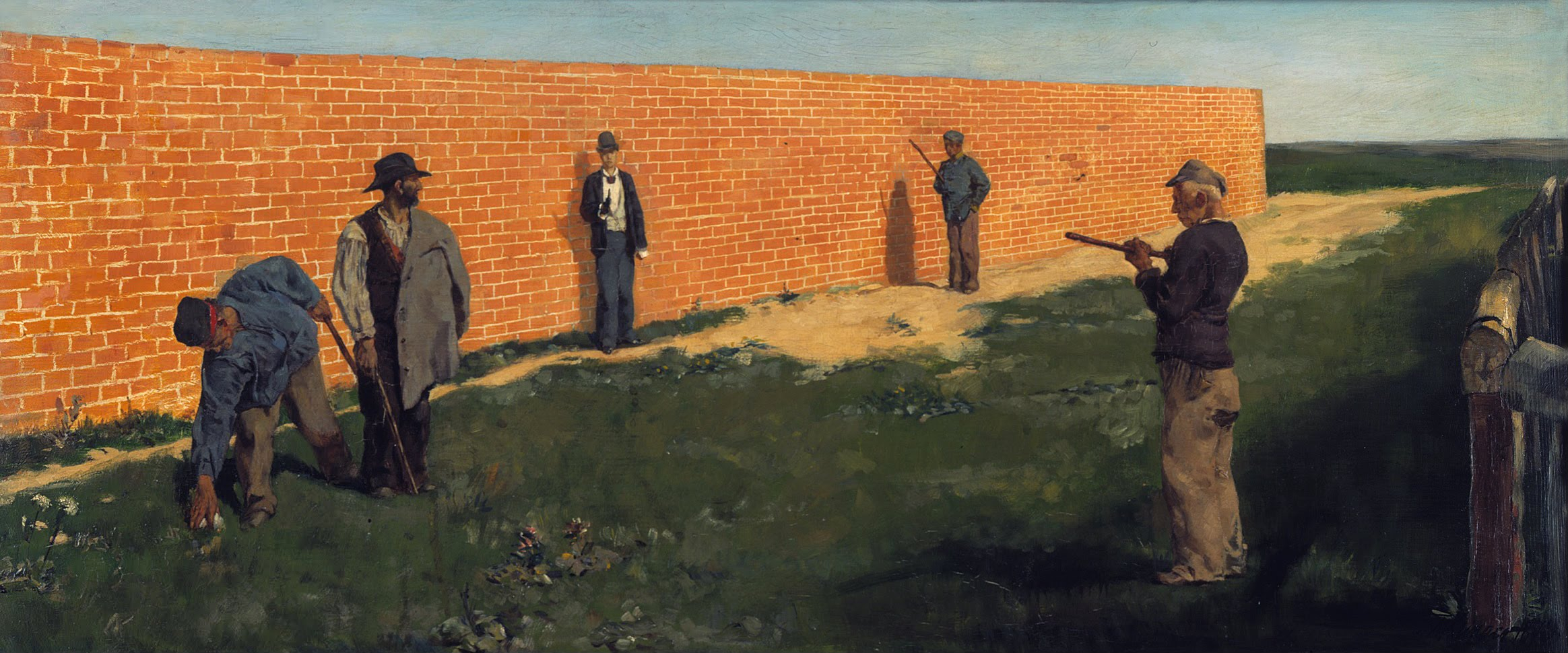
"The Walker" by Max Klinger
Unity - The general setting of this piece I feel has a sense of unity. Aside from the men, there is one long brick wall, and a long stretch of grass and earth, along with another long stretch of sky at the top. It doesn't appear cluttered or chaotic at all, since there are mainly three large portions of something (color/texture/etc). Even the figures are generally standing similarly, and are small enough in scale that they aren't a distraction to the unity, even though they do look different from each other. Nothing jumps out at you or feels out of place.
Variety- There is realistic variety with the clothing that the people are wearing, so it doesn't interrupt the unity and smoothness of the background. They are all wearing darker colors and each of them has a hat. They look fairly similar, in the sense that if you look at one man in detail, you don't really feel a need to look at the others, because they are all clearly the same kind of character. So, no, there is not any significant variety here.
Variety- There is realistic variety with the clothing that the people are wearing, so it doesn't interrupt the unity and smoothness of the background. They are all wearing darker colors and each of them has a hat. They look fairly similar, in the sense that if you look at one man in detail, you don't really feel a need to look at the others, because they are all clearly the same kind of character. So, no, there is not any significant variety here.
Repetition- The long stretches of the bricks in the wall and the grass could possibly count as repetition, maybe, since they take up most of the canvas, and while each brick or blade of grass isn't identical, they are all very similar to one another.
Rhythm- Everything is very "smooth". Your eye travels across the men easily and naturally, and then when you look at the background, the long stretches only get slightly smaller in scale (to signify distance), so your eye travels toward the end of the brick wall without much urgency.
Balance- The Rule of 3rds is being used here. The three "sections" that your eye looks at individually whilst looking at this piece consist of the man on the right side, the two men near the brick wall that are basically in the middle, and the two men on the left side. The one man near the fence is the one nearest the front and, in terms of scale, appears to be slightly bigger than the others. This is balanced out by the two men on the left side of the canvas, since they are posed less dramatically, so these two sections feel equal. The two men near the wall are also equal to the other two sections, even though these two men are the smallest in scale and most distant, because they are in the middle (which the eye tends to want to look at first).
Emphasis/Focal point- The way the men are placed makes your eye move from the man most frontal near the fence, to the others that are more near the brick wall, one after the other.
Proportion/Scale- The men are in proportion and the scale in terms of how distant the men are from the "front" are realistic. Doesn't seem to be very significant, other than how the scale affects the balance/weight of each third of the painting.

No comments:
Post a Comment