Showing posts with label PS1. Show all posts

Tuesday, December 18, 2012

PS1

                                         black pope ( sandwich board man)

                                         by charles white 1973


this painting  is a piece made by Charles W white ,he was  an african-american painter born in chicago iin 1918   , he is best known for painting pieces that depicted african-american history,socio economic struggles ,human relationships and portraits ,this particular piece caught my attention because he didnt use a canvas he used a cardboard a massive piece of cardboard and made an oil painting or oil wash of a black man handing out pamphlets of a restaurant and he is wearring a huge announcement board on his chest while he is wearing a catholic popes tunic and sacred religious popes clothes and the black man has a full beard (it can be easily noted by the shading he uses ,and his use of the solid color black ) and he wears a pair of sunglasses (aviators ) and on top of his head he has a hat with a big square cross made up off 5 small squares .

for this piece he used vertical line , horizontal lines , and curve lines and diagonal lines  ,he used solid colors and blended colors as well ,some of the colors he used where orange  light  brown yellow black,and he blended light brown with yellow and used the color black to make the shading ,all the coloring and use of light colors and the use of oil paint gave this piece the " vintage paint on cardboard  with fried greasy oil used to fry chicken look " he used all the negative space to make by painting a wall behind him he used the pattern of squares on this picture to make the "different color bricks on the wall " appearance , the focal point on this painting would he the poster board he has hiding in his chest because it gives the illusion that he tried to draw a religious theistic image but covered it up with layers of oil paint but in the background is the shape of a person with a cross behind that person .

the reason i was attracted to this piece is because it reminded me of one of my favourite characters in the show south park , the name of that character is Chef ,and also the similarities between this painting and the rapper rick Ross and apple the ap from the black eye peas

Tuesday, December 11, 2012

MoMA PS1

The first art piece to jump out at me was Anticipation created in 1961 by Alvin & Jeffalyn Johnson. Its an oil painting i believe of an African American woman awaiting the birth of what the caption says is her third child. The woman is peacefully resting basically Indian style on what seems to be grass while holding a few flowers. She's very calm and happy and seems to really enjoy being pregnant, since this is her third child. The painting is abstract with pretty pastale colors of light and soft oranges, pinks and purples. This adds to the peaceful and mellow vibe of the painting. There is various patterns in the negative space behind the woman as well as in her dress. She wears a smile on her face and this painting just shows how beautiful being pregnant and waiting to bring a little person into the world can be. Which is why i think this painting jumped out at me. 

I couldnt find a photo online or on the MoMA website.

Another art piece that jumped out at me was Leigh Taylor 1945 b Suzanna Jackson. According to the description, it's a charcoal drawing of an African American woman apart of the Black Panthers. She's looking to the left of the drawing, and even though the drawing is only of her head and shoulders, you can tell by her facial expression of posture that shes firm and strong as well as standing up for something she believed in. I got that impression before even reading the the description. Although simple, the drawing is very intense for me. It embodies everything the African American culture has gone through to get to where we are right now and that is one of the reasons i chose to talk about this painting.

I couldnt find a photo online or on the MoMa website.

Sunday, December 9, 2012

PS1

This museum had many things to choose from. The first piece I came across that caught my attention was a linocut/printmaking piece titled “Field” by Samella Lewis 1968. This piece has many formal elements. To begin with, lines are a very big part. The lines are very fierce in some way, very heavy and dark and a large amount of them. This is a 2D piece. The negatives and positive spaces are very tricky depending on which part of the piece you are looking at. One thing we can all agree on is that lines are in those spaces. There is some type of implied depth due to unclear negative space on the bottom half of the piece behind the women, and behind the lines behind her. The colors used this linocut piece are black and white. I feel like this was very smart on the artist part because if color was added, we wouldn’t get the same fierce feel she wanted us to get from it. The lines come up with different patterns, on her clothes as well as the circular figure around her fist, as well as the space on the bottom half behind the lady. Now the composition of this piece has a variety of “sections”. There is a sense of rhythm that the artist wants to keep inserting lines by in a different way each time. In my interpretation the focal point is her fist and what is around it. This piece shows a lot of power. I assume this person is black having been made in the 1960s where there was a lot going on and they were receiving power. It’s a victorious feeling you get when you look at it. I feel she lets you see things by the height of her extended arm length and having a powerful field, hence the title, starting at her fist expanding down half way.

Samella Lewis did the second piece I chose in 1968 as well, titled “Migrants”. The lines used in this linocut/printmaking piece are actual and implied. The bodies are somewhat linear and it’s easier to ready their body language because of this. The shapes are in small quantity but even then things like the moon are not completely circular because you can see its kind of linear as well. The negative space on this is that atmosphere which is behind the tall grass looking things all around the moon. There is implied mass because od the grass, you get a sense that there is think amount of layers since it fills up the space between each single grass itself. There is implied lighting from the moon which I find very beautiful and creative how she was able to figure out a way of doing it. Again she only uses black and white as colors but there isn’t any need for other colors in my opinion. There is unity with the people, and the grass being put so close to each other. The balancing of everything in this piece was done correctly. I think it was the rule of odds that made the balance this way from the one moon, to the seven people sitting down. The reason I chose this piece was because if felt she implied the quite opposite feeling she did from the previous piece. From the expressions on their faces there isn’t much joy. I feel as if they are hiding themselves from people, which might be because they are migrants. There is definitely a lot on everyone’s mind, mostly regret. It is a very strong piece. I hope she made this one before “Field” because it would give the critics more hope than sadness. 

Friday, December 7, 2012

PS1 review


At the PS1 museum there were many interesting art works but one that really caught my attention was a work by Fred Eversly the Green Full lens. His main desire in his works is to represent a formal manifestation of the principles of energy. He started his career in the late 1960s but created this specific work in 1976. Fred Eversly uses cast polyester for the medium. As the art work shifts in light or perspective it changes the appearance and color of what you see through the transparent material. As you look into the darker side of the object you can see complete emptiness giving you the feeling of being isolated somewhere and appears much like being in space.


Although there were many works that really interested me and caught my attention my personal favorite would be a work by James Turrell Meeting. This work is an Installation that has been at PS1 since 1986. This work is a white square room with a brown bench going around the wall leaving the middle empty. This room has a rectangular opening in the ceiling perfectly placed to view the sky. A particularly silent room in which you can watch how all the clouds pass by and feel completely relaxed. On a sunset this room is known to change color and becomes lighter than usual.  

PS1

Only Love Saves the DaySenga Nengudi 1943
nylon, sandbags
This 3D work sits quietly in the corner of a room in the museum.  The stretched nylon reaches outward towards the viewer; the elongation allows the material to make distinct lines against the wall and even creates shadows which imply more lines.  The up-right-ness in addition to the extension of the pieces of cloth, made the work look to me, like an abstracted human- a nylon stick figure. Nengudi only uses two colors of nylon; black and white. When first looking at the piece, thoughts of suppression came to mind.  The white piece of nylon hovered over, almost trapped, the black piece.  Looking at it closer (and not noticing the title) the material and the shapes the material formed began to feel like it was suggesting something more sexual.  The center of the piece twists, and stretches the material to create geometric and organic shapes. It may have been the symmetry or the one vertical piece that made the shape in its entirety look like underwear, but it began to resemble sexual organs more and more.  Even the black piece of nylon in the back had a penal structure to it.  The bags of sand that work with the nylon to weigh it down help the viewers eyes work all the way around the piece using the mediums natural weight.  The three bottom strips of nylon in image were weighed down by sandbags and varied in the color of the sandbag itself.  The two white strips held black bags of sand, and the white one in the middle held a black one.  The mixing of the two colors gives off the feeling of integration.  Originally, I was surprised to see nylon being used with such plain colors, because I've usually seen a larger variety of colors used, since nylon can be playful in light or with layers.  It wasn't until after looking at the work as a whole, that I saw how Nengudi did use nylon holding importance to color.  The work is showing us that.  The sharp angles and the overlapping of the two shapes on top of the integration of light and dark, allow the viewer to feel the struggle between the mixing of races sexually while also seeing the beauty of it.  The title Only Love Saves the Day suits this piece because the message that it portrays is that, it’s only through love that we see the beauty in all beings and further create more beautiful beings of mixed entities. 

The second piece that caught my eye was :
American Problem Solver (1970s). 
John T. Riddle
mixed media
(Unfortunately, I couldn’t find a picture of it.) The mixed media sculpture was of what looked like a giant animated gun pieced together by different pieces of metal.  On top, placed in angles, sits the letters U.S.A in red, blue, and white respectively.  Its exaggerated barrel compartment and narrow curved neck and base, give the piece an animated feel.  Its nostalgic in the sense that it reminds me of The Animaniacs  or Looney Toons, weapons that look large enough to blast something miles away right from its spot. As an American I found it ironic how I could identify what that sculpture was but it took a second or two for the ones around it.   In the 1970's the Vietnam war was going on and I’m sure that many people who felt as though the only way America solves her problems is through violence.  Riddle is expressing his opposition to the war and to violence in this piece.The work itself looks like it could have been an identifiable weapon in any time through America's history; a cannon, a gun, a ray that shoots out demolishing rays of light (to get futuristic). Because of its size and demanding presence, I feel as though even though the weapon seems to be pointed downward, it still looks as though it can be fired and harmful.  The colors of the letters stress the emphasis of our particular use of weapons.  The quilted pieces of metal contrast greatly with the softness, loyalty, and promise of piece associated with those letters and colors. 

MoMa PS1

MoMa Ps1


        The trip to MoMa Ps1 was astounding! I loved the endless variety display of paintings, and numerous sculptures. MoMa Ps1 projected a contrasting vibe as opposed to The Queens Museum (I got lost multiple of times!). The artwork displayed in this exhibition had a more modern essence, and presented a never-ending diversity of distinctive artworks of individual backgrounds. The main exhibition was entitled "Now Dig This! Art and Black Los Angeles (1960-1980) display. The exotic arrangement emphasized the rich beauty of African American culture of many African American artist who contributed to the creative movement of Southern Los Angeles. 

Apparitional Visitation, Suzanne Jackson, 1973)
Making a introductory debut as the first artwork of my choice is Suzanne Jackson's "Apparitional Visitation" (1973). This 2D piece is composed of Acrylic wash on canvas. This image shows the entity of a flower, a woman and a flamingo. What may draw the attention of many viewers is the face located in her torso and the outline of a ghost-like figure in the background. As for formal elements, there are primary colors, dominantly red, and several values of red such as pink, flamingo, and deep red intensified in the color. There is a hint of green, used to compliment the use of red. The Rule of Odds is exemplified clearly in this painting. The woman's face seems calm and hardly tense. Apparitional Visitations appears rather pure and illuminated. The name Apparitional Visitation allows me to speculate that maybe Suzanne is trying to imply the visit of an unexpected person. The Iconography appears to be the ghostly figure. One can say that the face embedded in her torso is represented through the ghostly figure as the unexpected visit. It may be a form of communication between Suzanne and a very important person that she has loss in her life or simply someone that she misses. The flamingo and the flower are aspects that are serene to Suzanne and may share a connection between the presented individual. She is somewhat infused with the figure and the face as if she is trying to exemplify the fact that they are one. Overall the painting is very intelligible and spontaneous in choice of implied components, Suzanne uses transplant and very fluorescent colors to imply the innocence of absence to signify that the individual will never be forgotten. 


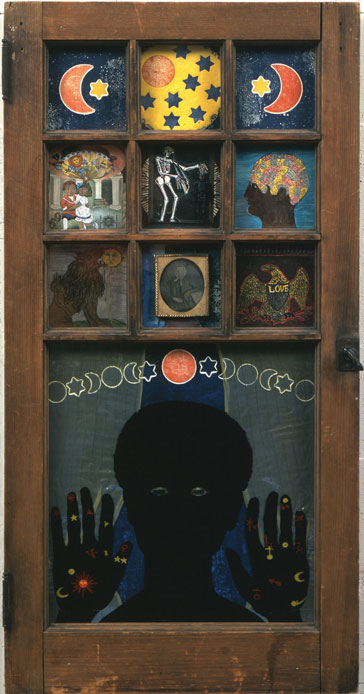
The second piece seemed popular among the class. "Black Girl's Window" (1969) by Betye Saur is a 2D mixed medium piece. With an interesting nocturnal twilight theme, Black Girl's Window is a compilation of organic and geometric shapes. The windows show a variety of subjects that imply a singular emotion for each. There is a silhouette of a young girl, I speculate that the title of the piece is based on the young girls outlook on her window. There is a dominant use of cool and dark midnight colors. There is a subtle hint of repetition in the image of the moon and star, yet the piece has variety of distinctive images provided in the boxes. The young girl in the image may or may not be a representation of Betye, but it is clear that emotion is communicated through her eyes, which seems saddened. This tells me that the images is a symbolization of desires, fears and childhood as seen in the separate images. The topic of childhood is seen in the first box, fear is displayed in the skeleton and desire is represented in the final box, with the term "love" written across. Emotion is also conveyed in the hands, the hands show a sense of surrealism. It tells me that the girl is lacking these components in her life, making her feel incomplete. It may be an outlook on very vital stages on ones life that made it's mark on one's identity.

PS1


  As I was walking around the PS1 museum the first artwork that caught my eyes was “Black Girl’s Window” by Betye Saar. It’s a mixed media assemblage, a painting in a wooden window frame. This artwork features the silhouette of a black girl pressing her hands and face against the window. Above her head there are small openings in the window that reflect different symbols like moon, stars, a skeletons, human brain, a eagle with a word “love” on a shield , a child with mother and someone’s portrait. The colors used in this artwork are mostly dark, such as dark blue, gray and black, but we can also see brighter colors in the small openings like red, blue and yellow. The artwork has both organic and geometric shapes, its form is three dimensional and it has rough wooden frame texture. The focal point in this artwork is the silhouette of a black girl. The wooden frame provides repetition of square openings which gives a symmetrical balance to the artwork. Different symbols in each opening shows variety.  I think Betye Saar artwork tells about her own life, and the black girl in it is her. My subjective though is that she used window to show that looking through it she searched for meaning, thoughts and feelings about the world and each opening holds a different personal symbol. Above the figure and as well in the top panes we can see different phases of moon which may symbolize the passing time. The middle left pane depicts a couple probably her mother, symbolizing love, family and home. In the center pane there is a white skeleton manipulating small black skeleton which I think symbolizes the racism toward the black people. In the middle right pane there is a human brain symbolizing knowledge and thoughts. The eagle with a “love” on a shield, probably symbolizes the love for the country. I like the way she used symbols and window frame in artwork it seemed very interesting.
 

                The second artwork that caught my attention was “Panthers” by John Riddle, made from welded metal in 1970. The sculpture depicts a sickle decapitating shapes that appear to represent human heads. The form of this artwork is three dimensional; it has a smooth texture and organic shapes. The sculpture is very simple and balanced; it has only one color brown. The emphasis/focal point is the sickle with the wooden handle which is in full size, scale 1:1. The title suggests reference to the Black Panther party an African-American revolutionary socialist organization active in the United States from 1966 until 1982. The Black Panther Party achieved national and international notoriety through its involvement in the Black Power movement and U.S. politics of the 1960s and 1970s. From the title and description of this sculpture it was very clear that the aggression depicted by this artwork allude to the causalities inflicted on the Black Panther organization by the US government (sickle).

PS1

One of the artist that I chose to write about is Charles White, American (1918-1979).

The artwork I have chosen to write about is Birmingham Totem (1964). It is ink and charcoal on paper.


While creating Birmingham Totem in response to the bombing of the 16th street Baptist church in Birmingham, Alabama, on September 15, 1963. The bombing which killed four African American children, was retaliation by the Cahaba Boys, a Ku Klux Klan splinter group, against efforts to register African American voters; The Civil Rights movement, which used the church as a meeting place; and the discussion of integration in Alabama.

The drawing shows a young African American boy, shrouded in a large blanket, sorting through the debris of the bombing. I love the negative and positive space that the artist used to bring more intrigue to the drawing. His use of lights and darks really brings out the drawing. I think it adds intensity to the drawing. I think this is a conceptual art piece and also it is both dry media and liquid media. This drawing shows pain and suffering. It shows that by the boy covered in a blanket and he looks unclothed. Also by the pieces of wood that the boy is looking through makes it seem like a disaster happened. Charles white did a great job bringing the drawing to life and making it pretty easy to understand.

The second artist I chose to write about is Thomas Lanigan-Schmidt.

The artwork I chose is called Lollipop knick knack (let's talk about you).


Thomas Lanigan-Schmidt’s mixed-media constructions, collages, and installations are marked by a trashy opulence concocted from household items and dollar stores. Mimicking Byzantine decoration with cellophane, aluminum foil, tinsel and glitter, Lanigan-Schmidt (American, b. 1948) pioneered a maximalist aesthetic in the late 1960s that explored gay sexuality, class struggle, and religion. Mingling high with low, and sacred with profane, Lanigan-Schmidt bucked the reductive tastes of conceptualism and minimalism that dominated his youth, creating a radically decorative practice that, despite its influence, has never been properly assimilated into the history of American art. 

 Lanigan-Schmidt is a pioneer both in his use of reflective materials (plastic, Mylar, colored foils, chenille stems, staples and all manner of ephemera) and in his unique confluence of aesthetic, religious and secular thought. Which is everything he used to make this art piece. This piece has a naked man with a star where his privates are. It also has a lollipop sticking out by where the star is at. It is a sculpture. The sculpture is 3D and the artist uses alot of variety that provide interest and contrast.He uses a bunch of different colors that are bright and really stand out. I think the focal point of this art work is the lollipop sticking out behind the star that is covering his private part. The lollipop adds alot of emphasis. In my opinion this art piece is really flamboyant.

PS1 is a great place to visit.

Museum trip PS1


Museum Trip PS1

In the Museum of modern Art I find interesting art works. I am going to describe two of them. Before I also want to say about the entrance to the museum in one of the rooms of there is a small screen under the floor. A really small, I could say about 2 inches by 2 inches. You see in the screen a person asking for help like the person was trapped under the floor with fire around the person. Every museum makes interesting things from the beginner to the end. The title of the first sculpture I am going to talk is Three Round Sculptures. These sculptures were made by Fred Eversley, American b 1941. These are polyester sculpture. It is made by geometrical shapes.  Usually his sculptures are related to concept of energy, since his studies were in aerospace engineer. He was always exploring for space color and light. I chose this sculpture because I am studying Mechanical engineering and it also studies energy in some chapters. I believe he was very smart to use engineering and apply to make this wonderful art sculpture. This art if formed for three round shapes. They are like crystals with beautiful colors. Even though they are separate they form a unity in this art.  The one in the left is blue and transparent in the center. The middle one is all black and the one in the right you see red, blue and yellow, and also transparent in the center. Their shiny depends in the light room. So the view of these round shapes will vary I different rooms with different light.  In my opinion he wants to demonstrate how interesting a science could be when we emerge into it to study. In the beginner a thought engineering and art was completely separate and they couldn’t be together but with this art I realize that there are a lot of things we can do combining science and art. This art is a beauty with a science message.
The Second art work I chose is from John Outterbridge, with the title Urban Man. When I was little far from this piece, I thought it was an astronaut. The man was dressed with a metal uniform, having long legs. Getting closer and closer I realize that his head that was coming out from his metal round torso, little bit toward to the left, had primate form with curly black hair. Having in mind the theory of the evolution from monkeys, it was like a face from a man right after the evolution. Also he was using headphones and a antenna was coming out from his right shoulder. In my opinion, he is representing the evolution in technology in the humanity. He relates the past with the future. I can imagine how we will be without the technology that we have nowadays. We have developed technology according to our needs. Even though we create better and better advances in the technology field, we will be always the same human beings.         
-->
After visiting the museum, there were two artworks that stood out for me which are “American Dream” by Raymond Saunders and “Black Girl’s Window” by Betye Saar. Both pieces were located in the Now Dig This! Art and Black Los Angeles 1960-1980 exhibition on the first floor. Artist from this exhibition helped shaped the creative output for Southern California. American Dream is an oil on Canvas piece made by Raymond Saunders. It is representational and shows many formal elements such as lines, shapes and color. Lines that can be seen are diagonal, vertical and horizontal. There are mixtures of geometric and organic shapes. Complimentary and primary colors are shown. Positive space would be the picture itself and the negative space would be the background of the image. Pattern can be seen when looking at the stars on the American flag. The texture of this painting is implied. It is implied because it takes the form of a ripped up newspaper article. Its not actually ripped, it was painted that way to give off the idea. Also implied texture can be seen with how the painting was painted. Based on the context of the painting, I was able to make an assumption. The way the paint is makes it look like the surface is rough. I feel like the painting is symbolizing irony. The reason for this is because when we think of the American Dream, we think of peace, freedom, equality and so on, but when looking at the painting, it gives off a different vibe. African Americans were treated very differently during these times while they struggled to gain equality yet the title of the piece says “American Dream” which reveals a huge contradiction.

The second piece was “Black Girls Window” by Betye Saar. This shows an African American girl who is looking through a window. The pictures above her are what I believe to be things in which she sees. Shapes, lines, and pattern are shown in this. Shapes that are included are geometric and organic. Geometric shapes can be seen in the stars and moon. Organic shapes can be seen in the little squares of the upper window including the last one that shows a bird. Lines are diagonal, horizontal, and vertical. Patterns can be seen with the moon and stars. There is a mixture of complimentary and primary colors. On the top of her head, the stars and moon come together taking the form of unity. I didn’t really get much out of this artwork. What I think the content of this piece is, is that everything shown is what she sees while looking out of her window. However what did stand out for me was the skeleton in the middle square. I believe that this represents death and that she sees something relating to that (Subjective thought). I’m guessing that since this piece was made in 1969 and knowing context, death was on her mind often due to the inequality that African Americans faced throughout society.

SP1

The trip was great last Friday. I chose two art works to present.

The first one i choose is the Fred Eversley's works. The medium of this works is the cast polyester. He uses the highly translucent,reflective surfaces of these sculptures  to produce an optical experience. Those basic geometric forms emerge the light refraction. Walking around these small monoliths,gives us multiple ways to view light and changing color through the translucent materials.  When u take a look at it , it make you feel you are looking at vast area not just the spheres.

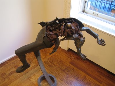
The second piece i chose is the "Gradual Troop withdrawal"  1970 by John T. Riddle . In the gradual Troop withdrawal, riddle depicts a solider sprawling backward, supported by a circular steel frame that extends from his left leg.  It seems like  he's struck by something with power and that thing blows him up into air. Wood chip and some sundries represent his viscera and what is inside the body is already mass up. And the head is half missing. it looks like some one just get shot and fall backward. I think the artist try to show us the war is cruel.

Thursday, December 6, 2012

PS1

"Black Girl's Window" was painted by Betye Sarr in 1969. Sarr used mixed medium. She used geometric shapes on wooden window and organic shapes on moon and symbols on the hands. The color that Sarr used for background was dark colors such as gray and navy blue. The deep values of blue and grey that laid as a backdrop to the silhouettes of skeletons and a human form were hypnotizing. She also used bright and bold colors such as yellow and red for detailing the drawing and highlighting the symbols. However, in Black girl's Window, Sarr colored the main figure, black girl with color black to show that she was an African American. I believed that Sarr particularly painted this figure black to reflect her identity as African American Woman. There was something truly wondrous about the piece and its description. The title states the idea of a window, and just by that there is the urge to look and discover. To accompany that, Sarr  also puts the description of a girl and her ethnicity into our minds as the viewer; by placing this context into our conscious, the audience is encouraged to interpret every fragment of the piece as a narrative. As the feeling of curiosity overwhelmed me, I began to notice that the emotions that this piece evoked would be frighteningly similar as would a young girl as she were to watch events through her window. I feel that this collage of three dimensional objects combined with illustration stands as one of the strongest art pieces with a narrative that I have yet to see. Subtly, the silhouette of the girl stands that the bottom of the window pane as she peers outward to view the world around here. This is a feeling, both as a child and as an adult, that we are familiar with. This aspect to me, is what makes the piece feel close to home and strangely familiar. Our minds feel wired to wonder as a child, which gives us the sense of nostalgia as we reflect upon it as an adult. Moreover, the profile view of human head is used. I think that Saar used human head as symbol as what kind of mood she wanted to set in the artwork. For instance, the human head in the Black Girl's Window, had flowers all over the head. The flower was used to express the feminism of the girl. A window frame is an item we commonly see in life. In Black Girls Window, I believed the window frame gave the painting a clean finish, and it created Sarr's own unique art style.


Swept by Dale Brockman Davis in1970 is a mixed medium which includes a broom, pieces of wood and paper in a frame. This is a 2D artwork with 3D objects. The background is painted and a broom is placed leaning against a screen door.  The broom is wooden, with the bristles wrapped with leather. The focal point of this work is the broom and the style is naturalistic. The black wall is the negative space and the broom represents the positive space. In African American culture, brooms are frequently used in weddings ceremonies in a tradition called “jumping the broom”. The custom began during slavery were black people were not allowed in churches, instead a bride and broom will jump together over a broomstick. It is kind of sweeping old life and leaping into new life. 

PS1

         Black girl's window was painted in 1969 by Betye Saar. It is a mixed medium piece, because of the painted art and wooden door which is 3D.  Saar painted a little girl looking out the window, on her hands there was symbols and markings.  There are shapes, patterns and symbols.  The material used was a wooden door, a small picture frame, paint and brush.  There are geometric and organic shapes.  The wooden door, it being a rectangle makes it an geometric shape, also the stars and triangles.  An example of a organic shape in this painting is crescent moon, and her hands.  In each little window on the door something is drawn or put that represents something about the artist.  There is a picture of her grandmother, representing her Irish heritage.  This small tableaux represents destiny and is very mystical.  I think this painting also symbolize what the artist, Betye has seen and been through growing up s a child.  the lion in the painting represents her astrological sign.  

       Swept by Dale Brockman Davis painted in 1970.  this painted in a mixed medium, the background is painted and a broom  is placed leaning against a screen door.  The broom is wooden, with the bristles wrapped with leather.  These materials used creates an actual texture.  Materials used in this painting was a broom, paint, brush, and a canvas.  rectangle piece of wood is a geometric shape.  The background of this piece was painted with a brush and paint.  The colors used are mainly earth like colors such as brown, and a antique red.  The rule of odds was also used, with the broom, wooden door, and a brick.  The broom symbolize marriage according to the African American culture.  It first began during slavery, when a couple got married jumping the broom meant jumping into new beginnings and a new life together with their spouse. it was a way of sweeping away the old and welcoming the new.


PS1 TRIP

            The first work I want to talk about is an untitled assemblage by Noah Purifoy. It is a collection of old things put together. That’s why it’s an assemblage. For example I see, boots, shoes, hair brushes, bones, and clothing. Overall there’s just a collection of old stuff put together. By putting everything together there’s unity because it seems as they are creating a coherent whole. And there’s also variety because there’s it’s all the different things that make the assemblage look so interesting. Now this is a 3d sculpture with an organic shape. There’s also no negative or positive space. Also it feels like it’s monochromatic because it has a brownish look if you just look at it as a whole. And the last thing I want to point out about the elements is that it has a course texture so it’s obviously actual texture. When talking about content I want to say that this assemblage can be looked at in so many different ways. Noah collected these things from the watts riots (black community neighborhood riot in Los Angeles in 1965). So he collected the materials and started to make different sculptures using rumble detritus left in the aftermath of the riots. So by collecting the old remaining’s I think that Noah Purifoy wanted to show the pride he had for the black community and what a magnificent sculpture it is. So I believe this assemblage will always be important because future generations have an opportunity to look at history.
            The second work I want to talk about it’s a mixed medium called “Swept” by dale Brockman Davis. The work features a broom, which leans against an old screen door. The brooms bristles are wrapped in folded leather and a section of wall next to it has vertical striations, seemingly made from clay, which has partially worn away and chipped. In African American culture brooms are frequently used in weddings ceremonies in a tradition called “jumping the broom”. The custom began during slavery were black people were not allowed in churches, instead a bride and broom will jump together over a broomstick, symbolically leaping into their new life. So probably the artist wants the world to understand a particular wedding   tradition that was popular in African American culture. This is of course a 3D sculpture with an organic shape. The black wall is the negative space and the broom represents the positive space. Also I see a lot of variations of the same color, for example the broom and the chipped away section of the wall are very similar in color. And it feels like it’s a rough fine texture but not smooth. So this is a very interesting sculpture because it has a lot of symbolism which makes you think about the meaning of the work, and I believe that if an artist makes the viewer think hard about the content of his work, then his work is a big success. So in a way both works are similar because of they both show something about the African American society and culture.

Fenglei's museum


Wanted Poster #6
          The class trip on Friday to MoMa PS1 was a great, I saw many great paintings and sculptures. The two arts I pick to talk about is the “wanted poster #6” by Charles White and “America the beautiful” by David Hammons.
          The first art work is “wanted poster #6” by Charles white, the art is a oil wash on illustration board and was created on 1969, this is a two dimensional art, which has a smooth texture. It has repetitions of stars behind the female character. The art only have 2 colors, which is black and white, the focal point for this art is the female on top and the little kid on the bottom. This art is also representational, the female and the child resemble real life people. My personal view on the content of this art work is about slavery, the title of the art also says it when it said “wanted”. So I believe it is about slaves like women and child run away from white masters, rather than go out and look for them, the white masters will post poster around the town of the runaway slaves and how they looks, within this poster there will also be the names of the slaves and the rewards people will receive for the return of them, if anyone see this kind of posters with rewards, if they see the slaves, they will definitely try to capture them and bring them back to the master.
 
         The second art work I want to talk about is “America the beautiful” by David Hammons. The art was created on 1968. This is also a two dimensional work, the colors artist use are black, white, red and blue. It has repetition of stars on the American flag. The focal point is the person with the American flag around him, it also makes him the positive space, and the background negative space. This art is form by an African American place a white paper in front of his face and body, that’s why the body looks like a human being but his face does not. I believe the content of the art is about racism in America. The artist want to show people we can’t treat people differently base on the color of their skin, he shows that with an African American with black skin color, but after placing white paper in front of him, he became white. It shows me that under our American society, both blacks and whites should be treated equal

"The Wine Leading the Wine" and "American Dream"


"The Wine Leading the Wine" by David Hammons is a 3-D piece. It is made of various materials including wire and glass from wine bottles. The most striking element of this piece is its use of lines - the piece itself takes the form of a long, twisted, imperfect line. Since the ends of the line are connected, it is technically some kind of geometric shape. I can only imagine the texture, since we aren't allowed to touch it, but I think the texture is strongly implied anyhow by the materials used and the "frayed" parts of the structure. It looks dangerous and sharp and foreboding, and not something one would want to touch. I think that the artist must have painted over the structure in dark paint, considering the variety of materials used, in which case the dark color must be intentional, most likely to make the structure even more dirty looking and foreboding. The overall effect is very striking - it doesn't look like its materials, it looks like an alien, black sludge. The title is apparently a variation of the phrase "the blind leading the blind". This, paired with the piece's connection to African American social commentary, makes the meaning quite clear in my opinion. The structure is the embodiment of the corruption and brainwashing that leads to the kind of journey African Americans have faced in their quest for social and political equality. The racism that has caused the kinds of issues African Americans have faced is something that has been frustratingly hard to end. Throughout the past century, the American population has slowly made the progress necessary to stop the cycle of racism - not just inside people's heads, but within our government and social constructs. If I were to put myself in the shoes of an African American in L.A. during the 70's, I would be impatient as hell for justice. The 70's I think were a very interesting time period - there was so much change and revolution going on, not just among African Americans, but also women and the feminist movement. Yet, at the same time, the majority of America was still ignorant to many of these issues and continued to be guilty of things like racism and sexism. I think this piece conveys what it is like to watch your country continue to be trapped in its ancient cycle of inequality.


"American Dream" by Raymond Saunders is a 2-D painting which also makes use of the medium of newspaper. The colors used are black, white, and red, and along with these colors, the artist has made use of lines to create a striking image. The majority of the canvas is black, and on top of the black paint is a vintage newspaper clipping of an African American couple. The fact that the image in the newspaper clipping is clearly not from the 70's reads to me that this is a social commentary similar to something like "A Raisin In The Sun", which took place in the 50's and also dealt with the idea of the American Dream, and what that meant for African Americans. The 50's and 60's were a time when the America was changing, and this also affected the idea of the American Dream. As populations such as the African Americans became closer to White citizens (the ability to vote, the emergence of African American pride and culture), the ability to achieve the American Dream started to become a reality. Yet, the concept of the Dream has ever since been muddled. Some think of the American Dream as revolving around money, while some see it as being an educated and decent American citizen. Either way, it is clear that at some point, African Americans were also promised the American Dream.

The large black section of the painting with the newspaper clipping signifies to me the mass of African Americans - or Americans in general - who were promised the American Dream, and who tried to achieve it. The red line to me marks the American Dream. The space below the red line is very small. The message overall seems to me to be that African Americans, during a time when things like slavery and Jim Crow laws were behind them and they were almost comparable to White American citizens, started facing a different side of racism. That is, the problems that come with being a discriminated against population in the modern world, where people aim to be successful and educated and wealthy.