
Tuesday, October 30, 2012
Monday, October 29, 2012


Sunday, October 28, 2012


.JPG)


Friday, October 26, 2012
Old Guitarist by Picasso

"Child of a Dove" by Picasso

This picture can make our mind peaceful. A dove represents Peace,
Holy Sprit and Love. The young girl is holding the dove and the
expression of peace and calm on her face gives us a small insight as to what is happening in this picture. Representing a young girl shows youthful,innocent,tenderness, fantasy and reality. By painting the young girl and the dove together, it would help the future of the world.
Art

Benny Andrews
(1930 - 2006)
Narcissus, 1980
This is a 2d work. In this work the artist use two styles painting and drawing. He uses painting style for the background for the sky water and earth and he uses drawing for the woman shape and the flowers that are close to her feet. Objectively this work is about a woman fixing her hair in a natural environment. Subjectively I could say the artist wants to express us trough the work how delicate is the woman and that woman need similar care like flowers. Both are delicate and beautiful and both need a lot of care.
Before a Long Journey by: Geli Korzhev
Before a Long Journey
"Before a Long Journey" is a representational 2D, oil on canvas painting by Geli Korzhev. I enlarged the size of the image to provide a display of every minor detail from her facial verbalization to the fabric on her clothes. The painting conveys a gentle feel with the incorporation of circular figures and solid monotonous values of grey and steel blue, nevertheless her apparel offers a different message.
 |
Geli Korzhev, Before a Long Journey, 1970–1976.
Oil on canvas, 35 x 47 inches.
|
Gowanus Canal from 2nd Street

Gowanus Canal from 2nd Street
Randy Dudley, 1986
This is a 2D painting that shows a warehouse and what it looks to be a junkyard, standing behind a body of water. The irony of this picture is the fact that this looks like a peaceful sight, but has a negative impact on the environment, which shows the artists style. The painting is representational since it resembles a real life visual on how a polluted environment actually looks. Subjective thought for this painting is that even the bad things could have its benefits.
Thursday, October 25, 2012
Drawing by R.M.

The form of this drawing is very neat. The color hues are used very properly by the drawing utensils chosen. The context of this drawing, is given as a country side village. Vintage cars, a barn, very home feeling of a kind. The composition is set up nicely, up close shot of the car, surrounding barns. That car being kept there could show some type of representation thats not seen by anyone but the artist.
Niagara
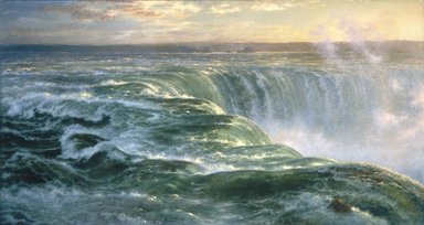 Niagara
Louis Remy Migont Brooklyn Museum
Niagara
Louis Remy Migont Brooklyn MuseumThe piece of artwork i chose is Niagara by Louis Remy Migont. It's oil painting on the canvas. you will feel the splashed water vapour envelop you. Rapid current pour down to the bottom of the waterfall. The sound of rumbling reverberates through sky. The splashed water vapor is dim moonlight under the sun shine. Its so representational that you will feel you are stand by the Niagara .
Sorrow by Vincent van Gogh

Vincent van Gogh used lines to create this composition. The style of art is representational because the woman in the picture resembles to the real world. It is titled "Sorrow" which gives off the objective thought. The picture has a meaning if a strong emotion of disapointment or distress caused by something. There can also be a subjective thought to this picture because the audience cannot clearly say what is the cause of the disappointment. To my opinion, since the woman is naked and seems to be sitting at the edge of something like a bed, and there is either a blanket or her clothing next to her, it seems like she could have just been though an arguement or physical abuse. I also make this assumption based on the time that the picture was drawn (1882).
"Life is Beautiful" by Farhad Moshiri

Variety- Different size and different colors provide interest and contrast.
Repetition and Rhythm - repetition of colors and shapes
Balance- using approximate symmetry ( color differences)
fenglei dai

Stepping Out
Roy Lichtenstein (American, New York City 1923–1997 New York City)
This oil and magna on canvas by Roy Lichtenstein is a 2D art form. which use mostly primary color. Roy use geometric shapes such as circle and lines in this painting to represent a person. this painting is divided into 2 style, the right half is representational and the left side is abstract. we can easily identify the right side of the painting because it is more resembles of a person, but the left is does not resemble anything, so we have to identify it by the long curve hair and red lipsticks, with those 2 information we can said the left side is a painting of a women.
Kandinskys painting

This is one of kandinskys paintings which of course is a 2d art form.I do see some horizontal and vertical lines and it feels very random.the other thing is that theres primary and even some secondary colors with no geometric shape. its very hard to see what the painting is showing us because this is a very absract style of painting that kandinsky is showing and the same goes for the context. So this is a very subjective and hard to understand painting. But i still think we have to appreciate this painting because of the unique style of painting this artist possess.
Spring by Daniel Williamson

Daniel Alexander Williamson, was a painter from Liverpool who spent
various years painting beautiful landscapes such as this 2-D 1863 oil painted
canvas entitled "Spring".
The reason why Daniel painted this was
probably to show us to take time out and enjoy our lovely scenery, in such a
way as the people of the 18th Century did.
I think the meaning of the painting
is to give people a sense of calm. In today's busy world, people tend to take a
beautiful scene like this for granted because we usually
don't spend as much
time as we should becoming one with nature. This painting uses a lot of primary
colors along with different shades of green, orange, and red.
The style of this
painting is naturalistic, it depicts a real country setting, one that city
dwellers are sure to comment on while driving by it. This piece of art has an
emotional effect on people, when they see it, they are happy to be looking
at such a great landscape.
Woman with Yellow Hair

This Painting was used oil to paint on canvas by Pablo Picasso. He use very simple lines to draw a Yellow Hair Woman sleep in the green and red bed. The painting is 2-D and organic shape. The Style is abstract. From painting, we can see that the Woman sleep very peacefully and relaxedly, and Picasso also uses warm colors( red, green, yellow) to try to give us a comfortable impression.
In my opinion, Picasso draw this painting to show that he love this woman so much, and he also hope that nobody can disturb this peaceful and their love.
Visual Elements

Jake at New Viet Huong, by elizabeth Peyton painted in 1995.
New Viet Huong is an asian restaurant in New York City. He is sitting at the restaurant having a couple of beers alone and watching someone or something. This painting consists of variety of red orange, used as the positive space. The angle of the painting is eye level. It has balance and an asymmetrical oil painting on masonite. Masonite is a kind of cardboard made from pressed wood fibers, which some artists use to paint on. Peyton uses a lot of red orange, which makes her style unique. In this painting Jake seems very mysterious. The rule of thirds used for the bottles on the table. The focal point is the way his eyes are focused on something or someone. Emphasis is the negative space, the red orange paint. Comeplementary colors used for his shirt and the walls. Subjective thought is still implied because we don't know what he is looking at or even thinking. i think he sees a nice young lady walking in the restaurant, and finds her interesting.
The Blinded Samson
The Blinded Samson by Lovis Corinth, 1912, is a painting made by oil on canvas. As I look at the painting, I see a man in his mid 30's not happy but miserable, as if he was getting tortured. The man is trying to walk out a room while he is blind folded with his hands chained up like a prisoner and is naked with only a piece of clothing covering his genitals. This painting was made in the time period where everybody cherish the human body. My subjective opinion would be that anybody anywhere can do something cruel and brutal to you. Corinth did not use bright colors but instead dark colors telling us it isn't a happy moment. This painting has a style of representational. The focal point in this painting would be the naked man. The man's arms have diagonal lines implying movement. The man is an organic shape followed by the door which is an geometric shape. It has a implied smooth texture and it is actually smooth because it is a painting. The painting is 2-Dimensional. The painting is not out of proportion.
Style


This two paint both are 2D form. They both are show about city, but they are different kind of city. The one on that right "Destroyed City" by Zasalamell. As we can see, it has a dark color at most. A big disaster happen in this city. There are many buildings get destroyed. Cars get broken on the land. The land are a lot ruins. Semms it is the end of the world. However, that are a little shine sun light on the sky. Which appear the hope is come. Light show after the disaster this city will be rebuild for tomorrow. Right on the left side is a paint art "New York City" by Reginald Marsh . All we can see is this NYC very Prosperity. High buliding, calm river, blue sky,and house. Everything are stand on peaceful and wonderful. A beautiful and strong New York City shoe on this paint.
The Saltostall Family by David Des Grages
This 1636 painting is 2D and uses primary colors. the image uses the rule of odds and also the rule of space, every one if off center. the focal point is the lady who appears to be either dead or ill laying on a bed with red draped curtains. the way the man is standing gives a sense of direction. my subjective views on this piece is the red that is used represents power. for the dead or ill lady the red drapes could mean the power of death. the red sheets covering the baby is the power of life. the two young girls dressed in red the power of growth and gaining wisdom. and the red chair the mother is sitting on the power to make/ bring life into the world.
The Abduction of Europa
The Abduction of Europa by Rembrandt Harmenszoon van Rijn
This 2D work painted in 1632 has primary, secondary and tertiary colors along with complementary colors. It is in balance with the rule of thirds, has diagonal lines implying movement in the woman on top of a cow in the water and the woman with the blue dress. There is implied light by the shading on the women's dresses, the horses and by the shades of their bodies. It looks like the woman on top of the cow is running away. By the way they are all dressed and the golden cart in the back it seems like they have a lot of money. There is a lot of emotion going on. By the way the lady in red is holding her hands together it seems like she is worried. And by the face expressions of the man and the woman close to the horses it looks like they are worried too. No one is trying to stop her so I believe they are all there to say good bye. The lady in blue with her opened mouth and the way her arms are raised it looks as if she is saying "GO".
This 2D work painted in 1632 has primary, secondary and tertiary colors along with complementary colors. It is in balance with the rule of thirds, has diagonal lines implying movement in the woman on top of a cow in the water and the woman with the blue dress. There is implied light by the shading on the women's dresses, the horses and by the shades of their bodies. It looks like the woman on top of the cow is running away. By the way they are all dressed and the golden cart in the back it seems like they have a lot of money. There is a lot of emotion going on. By the way the lady in red is holding her hands together it seems like she is worried. And by the face expressions of the man and the woman close to the horses it looks like they are worried too. No one is trying to stop her so I believe they are all there to say good bye. The lady in blue with her opened mouth and the way her arms are raised it looks as if she is saying "GO".

"Untitled" (Perfect Lovers)
Felix Gonzalez-Torres (American, born Cuba. 1957–1996)
Here we have 2 clocks on a painted wall entitled Perfect Lovers. Both clocks have the same time which according to the title means that both lovers are like soulmates. In my opinion it is two people who are so in love that they do everything together and their lives revolves around the other person that their times are synchronized. This is my subjective opinion. My objective opinion is that it is two clocks on a painted wall. Also is has a symmetrical balance. This is a great piece of art work.
Chantyll Ellis Queens Museum of Art
Chantyll Ellis
October 19th 2012
Art
October 19th 2012
Art
The
first piece of art I choose while inside the Queens Museum was a
painting by Simil Milatoni who was boring in Haiti. The woman's skin
color and hair in the painting is completely black giving off the
impression that her skin was smooth. On the other side the woman’s
jewelry and the feathered mask had color in it and implies texture. In
the negative space behind the woman, a certain pattern repeats itself.
The painting also suggest that there is light hitting the center of the
painting but is weird because the woman still remains solid black
without a hint of light.
The
second piece I chose was kind of the opposite of the solid black woman i
chose. There are tons of colors in the oil painting and a whole lot
more going on. There several woman in colorful vibrant dresses walking
about in a town laughing having fun. They surround their selves around a
building that has a lot of geometrical shapes with not only the
building itself but in the windows and doors. The painting shows
repetitive shapes in the women’s shadows. In each woman’s dress there is
a pattern but the one my eye directly goes to when I look at the
painting is the woman in from that has more colors in her dress than the
other women.
The
third painting I looked at while inside the Queen’s Museum was one of
what looked like the bottom of the ocean. The focal point of the
painting would be the bright red seaweed almost in the center. Other
than that the picture itself had a lot of variety in it between all the
seaweed and fishes and the other plants. The visual balance was pretty
much equal, having the same weight of elements on each side of the
painting. The artist used many variations of purples, browns and greens
to give natural look to the bottom of the ocean.
Tuesday, October 23, 2012
Queens Museum of Art trip
On our trip to the
Queens Museum there were countless works of art from paintings,
pictures, Sculptures and more. Each with a meaning behind it and a
unique work like shape,line, mass, value, color, texture, and
patterns. From drawing with lots of light to the ones with the
darkest shades.
The art work that
mostly caught my attention was “peacock of the sea” by Leo Matiz
which is a 2D image of a man caught in the middle of throwing a large
fishing net in the middle of the ocean. You can easily spot the
horizon line which give the image a more calm outlook a long with the
positive and negative space. To me this image expresses freedom and
joy even though its in black and white which some people that I
showed it to perceived it as sad and depressing.
the second work
that I chose was one from Dario Suro “Paisaje de lluvia” which
translates to landscape of rain. This image is as the title explains
a landscape with a lot of rain falling. The painting is in 2D. The
choice of color is mostly faded green with a bit of orange around the
bushes. The painting its self is all quite faded giving it a
depressing and gloomy feeling. The artist chose to paint a type of
tree which usually represents a place with warmer happier environment
and turned it into a more depressing and gloomy scenery by adding all
the rain, wind, and faded look.
Monday, October 22, 2012
Design Principles *late, sorry*
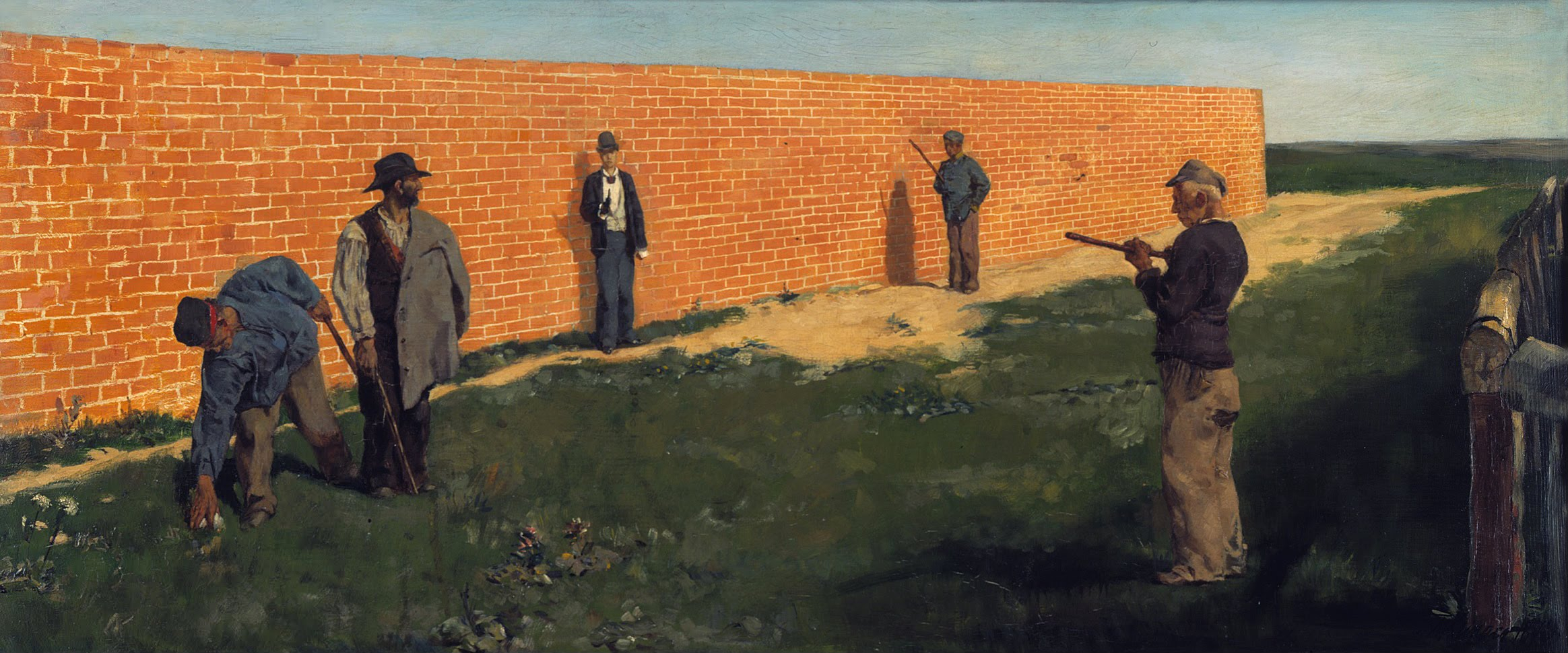
"The Walker" by Max Klinger
Unity - The general setting of this piece I feel has a sense of unity. Aside from the men, there is one long brick wall, and a long stretch of grass and earth, along with another long stretch of sky at the top. It doesn't appear cluttered or chaotic at all, since there are mainly three large portions of something (color/texture/etc). Even the figures are generally standing similarly, and are small enough in scale that they aren't a distraction to the unity, even though they do look different from each other. Nothing jumps out at you or feels out of place.
Variety- There is realistic variety with the clothing that the people are wearing, so it doesn't interrupt the unity and smoothness of the background. They are all wearing darker colors and each of them has a hat. They look fairly similar, in the sense that if you look at one man in detail, you don't really feel a need to look at the others, because they are all clearly the same kind of character. So, no, there is not any significant variety here.
Variety- There is realistic variety with the clothing that the people are wearing, so it doesn't interrupt the unity and smoothness of the background. They are all wearing darker colors and each of them has a hat. They look fairly similar, in the sense that if you look at one man in detail, you don't really feel a need to look at the others, because they are all clearly the same kind of character. So, no, there is not any significant variety here.
Repetition- The long stretches of the bricks in the wall and the grass could possibly count as repetition, maybe, since they take up most of the canvas, and while each brick or blade of grass isn't identical, they are all very similar to one another.
Rhythm- Everything is very "smooth". Your eye travels across the men easily and naturally, and then when you look at the background, the long stretches only get slightly smaller in scale (to signify distance), so your eye travels toward the end of the brick wall without much urgency.
Balance- The Rule of 3rds is being used here. The three "sections" that your eye looks at individually whilst looking at this piece consist of the man on the right side, the two men near the brick wall that are basically in the middle, and the two men on the left side. The one man near the fence is the one nearest the front and, in terms of scale, appears to be slightly bigger than the others. This is balanced out by the two men on the left side of the canvas, since they are posed less dramatically, so these two sections feel equal. The two men near the wall are also equal to the other two sections, even though these two men are the smallest in scale and most distant, because they are in the middle (which the eye tends to want to look at first).
Emphasis/Focal point- The way the men are placed makes your eye move from the man most frontal near the fence, to the others that are more near the brick wall, one after the other.
Proportion/Scale- The men are in proportion and the scale in terms of how distant the men are from the "front" are realistic. Doesn't seem to be very significant, other than how the scale affects the balance/weight of each third of the painting.
Sunday, October 21, 2012
QMA Art Compare & Contrast & Review

 The exhibition at the QMA that caught my eye was the "Carribbean: Crossroads of the World" exhibit. The Carribbean is one of the most culturally diverse places on Earth, and this exhibit shows this by featuring a lot of very different artwork. Two pieces of art that I was able to find photographed online are "T.R. in Panama" by Edward Laning and "Poster of La Plena" by Rafael Tufiño.
"T.R. In Panama" is a vivid and realistic looking scene. The entire canvas is filled with every detail of the moment - the smoke, the cloudy sky, the mountains and people in the background, etc. The colors and shapes are realistic and organic. This painting reminds me of classic war paintings like "Washington Crossing The Delaware". It gives off a feeling of chaos and movement and violence, but not in a negative way. It's almost desensitized, like something you would see in a history textbook. It looks as though someone recreated a photograph that was taken at the scene. It is not gory or dark - there is light, and light colors, and the focus of the painting is the center - starting from the man in the red shirt, and bringing your eyes up to the American Flag, in a vertical line. This painting has an aura of victory, and proud struggle.
The La Plena poster, on the other hand, is not realistic at all. The shapes are organic enough so that you can see that the focal figure is clearly an older man, and details like his hair and wrinkled face are there. Yet, because of the rigid light/dark contrast (there are pretty much only 3 shades of lightness on his face - white, black, and dark gray), it comes off almost cartoon-ish, like a semi-realistic graphic novel. It is quite curious, actually, how the unrealistic lighting alone is what makes the man look abstract, even when he is perfectly in proportion and made of organic shapes. His shirt is one shade of plain red except for some rigid shading to imply the folds in the fabric. The red shirt contrasts with his pitch black hands, which contrasts with the pure yellow background. The lack of lighting, shading, and detail in this piece are what make everything contrast so much. There are smaller figures in the background, but they do not call much attention. If you look at them, you can see that they are even less detailed than the focal figure, as though they were colored on MS Paint or something. The general feel of the poster is that of something almost mystical. Not magical, mind you, but the fact that it is an unrealistic depiction of a mundane human man make you feel that the scene from which this is captured must have had a strange, legendary, and emotionally and culturally-charged atmosphere.
What I feel is similar about the two pieces are the color choices - lots of red and yellow. Even the smokey-ness of the first painting cannot make it look nearly as gloomy as, say, a cloudy, wintery New York City day. It does seem as though these two pieces share a setting. I also think the overall tone of the two pieces is positive.
As for my review of my visit of the QMA, I have to say that I liked it, and found it less intimidating than other art museums I have visited. I usually feel very confused and under-educated when I visit larger-scale art museums. I never seem to know anything about the artists, or the movements, or the styles. Although there was a lot I didn't understand on a technical level at the QMA, sections such as the Carribbean exhibition I did not feel were intimidating, even though I had no prior knowledge of the styles or movements that they pertained to. The Carribbean exhibition, for example, was a testament to culture and diversity, which is something anyone can understand. This definitely made me appreciate my visit at the QMA even more than say, the standard school field trip to the MoMa (an example of an art museum that never ceases to confuse and overwhelm me).
Saturday, October 20, 2012
Queens Museum of Art
The Queens Museum of Art has many amazing pieces of art,
including some great paintings that could easily be interpreted and
understood. Both paintings that I chose to write about have many the
visual elements learned in class.


Both artists use primary colors and unity, as well as different
patterns to show the viewer an insight of the culture. Out of the many
paintings found in the Queens Museum of Art, these two paintings seem to
be very similar and have a lot in common. The unity expressed by both
artists gave me an idea of how people are in the countries depicted.

One of the first paintings that caught my attention is of the three
ladies dancing. This painting shows the repetition of the same outfits,
as well as the same stance. The artist emphasizes on the three ladies. There is a variety of colors, but the
painting consists mostly of a variation of reds and blues(primary colors). There are
different patterns throughout the painting. Some of the patterns are on
the dresses, the necklaces, and some are in the negative space. The
patterns are formed by the many organic and geometric shapes. This
painting creates unity by showing the three ladies dancing together. It
looks like they are doing a synchronized dance, and they look like they
are all wearing one dress connected at the waist. Not only it implies
movement from the dancing , but also from the "busyness"in the negative
space. Visual rhythm could be noticed as well. The diagonal lines to the left of the painting and the lines on
the bottom (where the feet are) imply movement.

Similar but yet so different, the painting of the vase of flowers with
tree branches around was once a country's flag. It was Haiti's National
flag from 1894 to 1948. The artist of this painting is Hector Hyppolite.
The painting is oil on cardboard and then mounted on wood. Just like
the painting of the three ladies dancing, Hector Hyppolite uses primary
colors. The variety of different flower colors brings unity within the
vase. There is repetition of the same flower but with different values
of yellow and red. We can also see the approximate symmetry in the
painting. Even though it wouldn't be exactly the same if we folded the
painting in half, on the first look it would be a mirror image. The artist
also includes pattern within the painting especially towards the top of
the painting. It looks like there are six wings opened up (blue/red).
The other pattern is of the tree branches and the vase. As we notice in
the writing of the painting, it mentions the word "unity" or "union."
The emphasis in this painting is on the vase filled with flowers.
Friday, October 19, 2012
HELLO!!
HELLO!!

I'm Monica. This is my first year at LaGuardia College. I'm studying OTA. I choose this class because I would like to expand my knowledge in Art.
DVD Dead Drop (close by in Astoria)

Costa Rican Fiesta
CARIBBEAN: CROSSROAD OF THE WORLD
This week the Queens Museum displayed an alluring exhibition entitled as "Caribbean: Crossroad of the World". Caribbean: Crossroad of the World" provided us with an insight of the Caribbeans wonderful history. What was defined through sculptures, paintings and film was the aesthetics in the landscape, languages and lifestyle belonging to the remarkable islands.

Costa Rica (1962) Honorio Cabraca Acosta
It was tough narrowing down my favors in a gallery full of art, especially for a picky person like myself, however, Honorio Cabraca Acosta's Costa Rica (left) stood out to me immediately. With what seems as a turquoise-greenish hue as it's top essential, What I loved the most about was Acosta's use of cool, yet electrifying colors. The painting is very surreal, it was as if you were there on Costa Rica's most luminous day! The painting depicted a tropic village landscape, where residents wandered and set up fruit displays. Speaking of fruits, I speculate the arrangement of fruit to be an embodiment of repetition. The Visual Elements portrayed in this picture are mainly demonstrated in the exotic clothing worm by the characters. The clothing displays warm and cool complexions of Complementary Colors but a vast majority of Tertiary Colors such as green, orange and purple, as illustrated in the house in the background. There is an interesting form of Implied Movement in the labor related posture of the men who are handling fruit among the crowd of people. Predominantly, Acosta's Costa Rica projects a great sense of a Costa Rican scenery. 
Fiestas Patronales (1936) Jose Ruiz
Colors, colors, colors! Speaking of colors, Jose Ruiz's Fiestas Patronales (left) was almost inevitable, with the use of the most cheerful hues on the color wheel, what can one admire more about this image other than amusement park nostalgia? Fiestas Patronales, translated as festivities consist of many Visual Elements thats naked to the human eye. To begin, this painting pops with dominant use of Primary Colors, such as yellow, red and blue in, this is also considered as Visual Rhythm, due to excessive use of repeated colors. The Vertically lined sidewalk and alignment of the crowd projects a tranquil environment where the people express happiness and Unity. As this is said the people represent Implied Movement in the act of walking, as the ferris wheel is implied to be spinning in it's usual circulation. I would generally consider the people and the rides as the Emphasis and the Positive Space in this setting, making the Negative Space the blatant blue sky and cement colored sidewalk. Visually, this accommodates a well Balanced visual, as where the amount of eccentric bright colors are in equilibrium with the silent dull colors.
Creativity of a Thinker

Invention (Composition 31), 1933. Rudolf Bauer
This first painting was very interesting to me because of how each object was positioned. The shapes shown are geometrical and vary in different sizes. Regardless if space is being shown between each of the shapes, the way each are placed brings the sense of "oneness" as if this is one object. Diagonal lines are the only lines being shown, which lets the viewer know that there is motion or that it gives a dramatic vibe. Rhythm is being shown as one shape follows the other. Colors shown are primary and secondary. The positioning gives off some-what of a happy vibe, but that all changes when you begin to focus behind the objects. What i find interesting about this is that the negative space behind the shapes takes the form of a black hole, taking your attention off of them and focusing on the darkness. So that happy image all of a sudden becomes sort of depressing when looking behind.

Glenn, Dario, and Tyrone (from The Garden of Delights), 1998.Iñigo Manglano-Ovalle
The second painting should have been my first. This by far is my favorite for some strange reason, simple, but it caught my eye and became interesting to me. This happens to be DNA fragments taken from others to form an art piece. As i looked this up on the internet, i found out that this is a photograph of DNA in which people gave in. Manglano-ovalle wanted to use this as a way of showing "family". 16 people were chosen for this artwork and by helping out, they helped fulfill Manglano-ovalle's vision of what he wanted to show. The rule of thirds plays a role in this piece as it is divided into three sections. This does show organic shapes. The shapes vary in different sizes. The piece follows a rhythm in which each section (the three sections) shows similar shapes. The shapes are positioned in a pattern. The second section shows implied texture where the blue is heavy. The positive space would be the DNA and the negative space would be the white/blue background.
Subscribe to:
Posts (Atom)