Saturday, December 22, 2012

Closing Note

Allan McCollum
Visible Marker - Thanks, 1988
A collection of five drawings
I just wanted to say thanks to all of you who made this such a wonderful, thoughtful, expressive class blog!
It was a great semester - even with the hurricane, and even with that epic walk to the QMA from the #7...

I am really impressed by the level of critical thinking and critical looking that you have done over the past weeks. Remember those early blog entries

Compared to these final posts all I can say is WOW.

So THANK YOU for all your hard work and have a nice holiday break!

This blog is now CLOSED!
-Dahlia Elsayed

Friday, December 21, 2012

Reverie: The Art of Surrealism


reverie: The Art of Surrealism
What Is Surrealism?
Surrealism is a form of art that diverts it focus to the visualization of extreme elements. Surrealism is Inspired by the philosophy of psychoanalysis and all that Sigmund Freud psychology, Surrealism plays with the functions of ordinary subjects and turns them into extraordinary matters.

Reverse Mermaid, Rene Magritte, 1940
African Sonata, Vladimir Kush
Elephants Reflecting Swans, Salvador Dali, 1937
The Elephants, Salvador Dali, 1948
The Elephants Celebes, Max Ernst, 1920

Location: 
Basing of popularity, essentially the exhibition would be located in the main hall (across the library), of the E-Building. I find this location to be the heart of LaGuardia Community College. Ideally this is where events are held and where hundreds of people cross paths on the way to class in a daily basis, not to mention countless of artworks are honorably displayed behind the glass here each semester, therefore the variety of audience will have it's benefits on the exposure. Generally, there is no main target of audience for this exhibition. Audiences of all kinds are welcome, because there is no need to set a limitation on art. College students however make a great audience for art displays, especially during a day of stress and weariness, this exhibition will be a great to accompany one in their agony of boredom! 
Surrealism Art is fascinating in every possible way, aside from the mind blowing appearance, Surrealism vitally captures and psychologically bends a variety of themes. Overall, my demonstration of "reverie: The Art of Surrealism"  will be portraying the surrealist version nature with a bizarre twist. The exhibition provides a broad outlook on Surrealism, however they relate in a sense. My main goal is for audiences to figure out the concept of the paintings, so literal thinking isn't gonna do the deed here! With a theme like Surrealism, there is so much to understand and analyze. It's very rare for one to not develop a personal subjective thought to it's depiction. Surrealism is one form of art that is unbelievably unusual that one would have to pay more than an instant glance. Practically I would prefer the audience to indulge the visuals that are projected using senses beyond the eyes. I want to capture the attention of each individual for at least five minutes per artwork. Sure these piece are remarkably appealing, but what kind of exhibition would it be if one did not stop to sink in the elements of artwork. It may sound clique, but this method of approach would generally allow the audience to appreciate the purpose of the creativity of Surrealism.
As the curator of this show I picked these pieces because the oddity and strangeness each depict the interaction with animals and their environments. The first piece is "Reverse Mermaid" by Belgian Surrealist painter is quite vivid by the title. This equilibrium of ocean and sand shows the infused entity of woman and fish, hopelessly washed upon a shore. This piece is quite humorous to me because it twists the ideal image of a mermaid, which is usually depicted as beautiful women with a fish body. Rene takes this idea of a fantasy mermaid and reverses, making it less attractive but far more interesting and abstract. This minor idealization tells me that one shouldn't always have high hopes, things may come unexpected. As shown, you can see that I've purposely chose four pieces that involves the theme of elephants. The incorporation of elephants were unbelievably common in Surrealistic Art. One interesting statement is that elephants were believed to symbolize strength, power, and wisdom. In Thailand, it is said that the trunk of an elephant represented good luck. 
Introducing my collage of elephants, "African Sonata" by Vladimir Kush depicts three Elephants with trumpets as the head. The rule of odds are used and one would speculate that the artist is a fan of African themed music, therefore he mixed a national animal of Africa with trumpets. This painting has numerous implications of music, such as the harp on the antelope's head, the tuba grass, and the swans seems to resemble music notes. I chose this piece because of it's obvious strangeness, one wouldn't have to search for the surrealism in this painting because it is naked to the eye, also to show that themes are usually relate to the artist interest.
The third piece is "Elephants Reflecting Swans" by the amazing Salvador Dali, one of the most known and appreciated Surrealist painters. This painting shows a dry looking landscape. The swans are shown looking into the body of water however their reflections come out as elephants. Everything is heavily abstracted, such as the clouds, the tree branches except for the swans and the elephants, which appears to be the painted vividly. One can say that Salvador is trying to suggest that reflection of all animals are of one despite physical appearance, animals dwell on similar survival instincts.
It seems that Salvador Dali is in fact a fan of elephants at this point because the following is Dali's monochromatic piece, "The Elephants", which shows two thoughts of elephants, however they're heavily abstracted. The legs of these creatures of stretched out. I simply wanted to strive for variety and I saw this painting as an emptier piece because it dominantly projects a vacant warm orange background and the elephants are rather disheveled.
The final artwork is one of my favorite, Max Ernest "The Elephant Celebes". This picture shows a large figure, which appears to be the idea of an elephant, however distorted with horns, and a mechanical design to it. One can easily tell that this subject in the image is an elephants, but the way that the elephant is drawn allows one to think twice about what Ernest is trying to convey. 
Together these pieces seems to provide a sense of escape, an aspect that Surrealism essentially depicts, Nature is heavily portrayed in these painting and generally used as the setting to create the proper atmosphere for the artist message. As the curator, I would suppose that Surrealist Artist felt that Nature is so outstanding in numerous  ways and I wanted to propose the wild life, and the distinctive reality of their nature, and how it is such a phenomenal topic in Surrealism Art.


Fab 5: The Starting Lineup

This show is about 5 of the best and most influential artists in the world, in my opinion. I know there are many artists that I can choose from besides the 5 I have chosen but these are the guys I picked nonetheless. In no particular order, Salvador Dali, Leonardo da Vinci, Pablo Picasso, Vincent van Gogh, and Claude Monet are the artist I chose. I am going to show you why I connect with these pieces of art and artists.


The location of my art show will be at the entrance of the E building. It is the best looking entrance, very spacious and the sunlight shines through beautifully. I would put all the pieces of art on the wall across from the court yard. The reason for me picking that hallway is because it's spacious and since the courtyard is right across from where I would hang the art work, when the sun shines it gives that area an aura.  It is the perfect area for the art show. The audience that I want to reach are the students who are art majors. In my opinion, seeing the famous pieces of art from those 5 men should give them motivation every time they pass through that area. Hopefully, enough that they will strive for greatness. Also, I would like to reach anybody who is interested in art and want to know more about art. Even those who want to shut down art programs in our schools to save money and resources are definitely the people who would be welcomed to see my art show. The more the merrier.
 

The theme of the show is to show the creativity that it takes to make a beautiful piece of art. That is why I picked these certain artists because when I think about art, I think of these 5 artists. I came up with this idea because in my sons’ school in Texas, they don't have an art program because the school wants to save money. This is the main reason I came up with the show. Art programs are vital to producing well-rounded children. Kids need a break from the usual math or english class in school. They sit and listen for a majority of the day anyway. An art class gives them something tangible to get their hands on and create something. They are creating instead of doing a math problem. Having these options available to students gives many an opportunity they wouldn't otherwise have. Giving kids an outlet for their creativity is a requirement. They need an outlet at school, which a traditional class is unlikely to give them. There are countless kids that look forward to school because of art class. That method of creation allows them to express themselves and feel unique and appreciated.


Here are the 5 pieces I would hang up in my show:


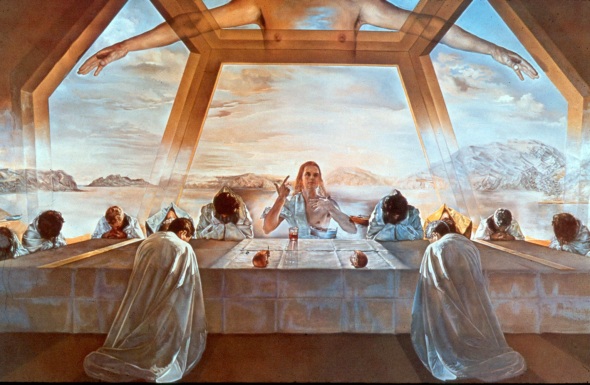
Salvador, Dali's  1955 painting, "The sacrament of the last supper", is painted in oils on canvas. The painting is 105 inches by 65.6 inches in size. The painting took Dali nine months to complete. In my opinion, the figure above Jesus and the seated disciples indicates resurrection. Another notable aspect of the painting is that the only face fully visible is that of Jesus himself. The disciples all have their heads bowed, as if they are praying or feeling sorrow. Dali, shows us in this painting his skillful use of pastel shades. The image of Jesus is captured in an mystical way. Everything behind the figure of Jesus is painted in a hazy, dreamy way, as if everything behind Jesus is heaven itself. The pastel shades are skillfully created to give the painting its glowing aspect. Dali has created an image of Christ that is not really stereotypical. The man is young and has long hair, but there is no beard. His use of soft colors makes the painting in my opinion. Also the horizontal lines makes the painting appear calm. His use of even # amount of things produces some type of symmetries. This painting has a sense of unity and putting jesus in the middle with a kind of bright light around him catches the viewers attention. Awesome painting!!

FUN FACT:

Salvador Dali was born in Spain in 1904. When he was a child, he showed strange behavior and often interrupted his class in school. As he got older, he started to paint pictures that came from his dreams. His dreams and his paintings were scary and unreal. Dali went to art school in Madrid, Spain. He got kicked out, and never finished. He even spent time in jail. However, he continued to paint, and his art style became known as Surrealism. Salvador Dali drew everyday items, but changed them in odd ways. For example, one of his paintings is of melting clocks. Before he died at the age of 85 in 1989, Dali had created works in film, ballet, opera, fashion, jewelry, and advertising illustrations.
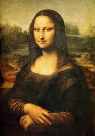


isa is a 16th-century portrait oil painting created in oil on a poplar panel in Florence, Italy by Leonardo Da Vinci during the Renaissance periodMona Lisa is a 16th-century portrait oil The Mona Lisa (1503-1516) is a half-length portrait of a woman by the Italian artist Leonardo Da Vinci, which has been acclaimed as "the best known, the most visited, the most written about, the most sung about, the most parodied work of art in the world. The medium is oil on canvas. The Mona Lisa is a 16th century portrait created in oil on a panel in Florence, Italy during the renaissance period. Images of the Mona Lisa are ubiquitous and so many people have seen it many times. What jumps out at me is the uncanny way that the painting seems alive and so realistic. Her eyes seem to follow my eyes. Her eyes look as if she is looking at Da Vinci in his eyes while he was painting her, which meets up with my eye line (eye level). Everything surrounding her face is dark, bringing more focus to her face. His use of lights and darks makes the painting standout. It is very representational with a good balance. I love his use of earth tone colors.e

FUN FACT:

Many question as to whether Mona Lisa is as much a portrait painting as it is depiction of an ordeal. The harmony between the model and the landscape behind her creates a sort of natural order, all punctuated by the detail of her mouth and that world famous smile.
o her eye line. Everything surrounding her face is dark, bringing that much more focus to the light of hee attraction it provides. The overall effect is a kind of natural attraction to her, drawn in by her appearan


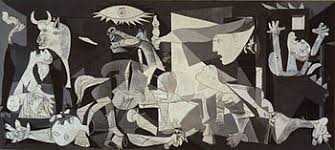
This painting is called "Guernica" by Pablo Picasso. This medium is oil on canvas. This painting was created in response to the bombing of Guernica, a country village in northern spain by german and Italian warplanes. Pablo Picasso was asked to create this large mural. Pablo Picasso was born in Malaga, Spain on October 5, 1881. His father, Jose Ruiz, was also an artist. Picasso painted in many styles, including Cubism and Expressionism. He also sculpted. "Guernica" is a very powerful piece. One reason is because of its size. The painting is over 11 feet tall and 25 feet long. Another reason is because if you keep your eyes on the painting and in your mind you visualize what you are seeing, it makes it seem as if you can hear the chaos that is going on in this painting. This painting is done in black, white and gray. In my opinion, painting it in those colors makes this art piece more powerful because you concentrate more on the figures rather than on the colors. The center of the painting is dominated by a horse, which is contorted into a painful position. The horse looks like it is in agony. Another animal in the painting is the bull. The bull is standing over the women in a watchful, almost protective stance. On the left side is a woman who looks like she is  grieving over the loss of her child. It looks as if the child is dead, due to the unnatural twist of his neck. There is a man who looks in pain  next to the lady screaming. His left arm reaches out ahead of him with his fingers in a claw-like position. His opposite arm lay beside him, severed at about the elbow. His fingers are still gripping the broken sword, and, at the same time, he is grasping small flowers. You can feel the energy from this painting and what the artist was trying to convey. His use of positive and negative space is tremendous. This painting has a certain motif about it. There is alot of variety in this painting but it still has that certain balance and sense of unity.


FUN FACT:

This work has gained a monumental status, becoming a perpetual reminder of the tragedies of war, an anti-war symbol, and an embodiment of peace. On completion "Guernica" was displayed around the world in a brief tour, becoming famous and widely acclaimed. This tour helped bring the Spanish Civil War to the world's attention.


 Here is a painting by Vincent van Gogh called "Starry Night" (1888). The medium is oil on canvas. There is the night sky filled with swirling clouds, stars are shining bright, and a bright crescent moon. Although the features are exaggerated, this is a scene we can all relate to.Van Gogh creates a sense of furious motion but the town looks very peaceful. The painting consists of blue and yellow hues, which are complementary colors. This painting consists of darkness and brightness, calmness and frenzy all in one painting. His use of lines and shape brings out the emotion in this painting. He uses primary colors (yellow, blue). The flame has great texture. The flame and the sun gives it balance and it definitely has organic shapes. Great painitng!!!

FUN FACT:

"Starry Night" is the painting of Vincent Van Gogh’s bizarre mind during that time. The year before he painted the piece, he got into a major fight with his most trusted friend, Gaugin and as the argument heated up, Vincent lose control of his better thinking that made it possible for him to cut his own right ear.

The depression about the incident made him suffer for so long that made his neighbors in Arles decide to send him to the Psychiatric hospital and it was during his stay in the ward when he come up with masterpieces that mainly highlights subject in the nocturnal setting like The Night Cafe and Starry Night Over the Rhone.


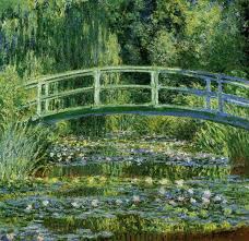
This painting is part of a series called "The Lily Pond Series" by Claude Monet. The actual painting is called "Waterlilies and Japanese Bridge" (1899). The medium is oil on canvas. His use of different greens and browns really work well with this painting. He makes the river flow seem realistic. This bridge was in his garden. The texture looks somewhat rough. Also his ability to make the trees look like they are reflecting from the river is a great gift that he had. His use of lines brings this painting to life. It has a little range of value and some what monochromatic with all the types of greens. It can almost pass for a symmetrical balance piece.

FUN FACT:

Monet died in 1926 in Giverny. Many people came to his funeral. Unlike many artists, he was famous even before he died. Now his house in Giverny is a museum that is visited by many people.


I picked these pieces not only for the actual piece of art but also by whom the artwork was created. As the curator of this show I picked these pieces because they are connected to each other in a way that no matter when you was born or how you paint and what type of equipment you use, art is a beautiful thing. The use of positive and negative spaces, range of value, colors, balance and emphasis all come into play when I talk about these artists. Even from a little abstract to representational, these artist are the cream of the crop. All the pieces that I picked connect with the theme of this show because if I had to go a give a presentation to those people who want to close art programs, my starting lineup would be these Fab 5.


P.S.  Professor,

I answered all the questions and I hope you like this very long presentation.  It has been a pleasure
being in your class and learning about art, which I may add, I learned alot. Thank you for making my semester that much better. Have a great holiday.
P.P.S.
I am looking for a grade no less than an A- (lol). Hopefully i get it. Have a great one.

War: What isn't intended


Description of the Show
I came up with the idea for this exhibition from constant interest in the effects of war. I was always a fan of war movies and famous wars, one being World War II.  I would always research a war and respect the soldiers who had to fight. Whenever a battle was taught in class, I couldn’t help but to become interested in the lesson. We were always taught the battles and who won or loss, but I began to think about how soldiers must feel in war. Were they upset? Were they frightened? Were they angry? Or did they have feelings at all? As this thought became more intense, I couldn’t help to become more interested on what went on through the minds of soldiers rather than the battle itself.  Soldiers have to leave their whole life behind in order to protect and serve that country that they love. With protecting countries and helping others, they must pay a price. I feel that this exhibition will help reveal the issues that soldiers have to deal with and the emotional stress that they go through while in battle. Not only does war affect soldiers, but also it affects life as well, by destroying land and killing innocent animals in order to succeed. 


Location
 For this exhibition, I would like to put it throughout the hall way of the M- Building. I feel like this would be an appropriate place for people to walk along and catch a glimpse reality that the war reveals. The audience that I like to reach is everyone, but mostly the people who usually are unaware of what happens in war and what soldiers have to go through. By it being located here, everyone throughout the building would be able to have a chance to see and experience the way life while in war.

5 Artworks and Why I Chose Them

 As the curator of this show I picked these pieces because I wanted to reveal how life is during war. Each artwork relates to the theme because the paintings reveal images that shouldn't have to be. War shouldn't be just another way of life because both sides are being affected, good and bad.


                                                 By K. Vasilev Sadness for the Motherland
                                                                      Oil on Canvas

I thought it was best to use this as my first piece for the exhibition. The reason being for this is because as men go to war, they leave their entire lives behind in order to protect the country that they love. They take on a major responsibility and job to keep the country safe and protect other ones as well. As we see our soldiers put their lives on the line, we could only imagine what their mind goes through. The reason why i liked this picture was because I felt that it addressed this issue. We never actually understand the emotional pain and suffering that these soldiers go through in the midst of war. As you can notice in the picture, there is only one soldier facing the other way. I feel that the soldier began to remember the memories of his loved ones, and developed a sign of regret for being a part of the army. I like this because we could only assume of what the soldier is actually thinking. The painting shows a great deal of formal elements such as lines, shapes, and unity. Lines shown are mostly vertical. Vertical lines reveal strength and are assertive. What I found interesting was that the line used for the soldiers gun that has his head turned around, is not vertical, but yet it is diagonal. What I'm guessing is that he is not a strong soldier, or his feelings have affected his performance as a soldier. Shapes used are geometric and generic.  Also the combined soldiers walking in the same path show unity.

                                                           K. Yakupov Front Sketchers
                                                                      Oil On Canvas

This second painting reveals a soldier writing in a note pad while other soldiers catch their eye on something else. What I believe is happening is that the soldier wants to take time to record his experiences in his notes. I feel that this is his way of "blowing off steam" or expressing himself since there really aren’t a lot of people that he could talk to about his feelings. He might have a way of bottling things up until his pen meets the surface of a piece of paper. This painting shows a great deal of formal elements such as lines and shapes. Lines used are vertical, horizontal, and diagonal. For example the soldiers gun takes the form of a vertical line revealing that the gun shows strength or in other words, makes the soldier stronger. Shapes, which are used, are geometric and generic. For example, bags on the soldiers waste take the of a square or rectangle.
 

                                                            Unknown. 1944. The price
                                                                      Oil on canvas


After the emotional stress happens, many soldiers pay "The Price." Soldiers put their lives on the line, which means that there is high chance that something may go wrong. This piece shows how dangerous war can get. Soldiers may become dismembered, have their body part mutilated, or have other damages to their bodies. I believe that a grenade thrown by an enemy soldier injured the soldier. This act left his arm shredded after impact. This painting shows some formal elements such as lines and shapes. The lines that are I could make out were diagonal. Shapes that were used were geometric. The soldier’s helmet reveals a geometric shape by taking on the form of a sphere or circle. Also the soldier would be positive space while the background would be negative space.

                                                         N. Prisekin 1941. Hard Times
                                                                     Oil On Canvas


This next piece shows that even the innocent falls in battle. When we think of horses, we think of innocent, beautiful creatures that people couldn't stand to hurt. As we look in the painting, we notice that even the good has a small chance on surviving through the war without at least something happening. What I believe happened was that enemy soldiers ambushed a carriage caused the death of one horse. Many formal elements can be found in this painting such as lines, shapes and pattern. Lines, which are shown, are diagonal. Shapes included are geometric as well generic. The wheel on the carriage reveals a geometric shape by taking on the form of a circle. Pattern can be seen when looking in the grass. What i found interesting was that even though one horse appears to be dead, the other stands tall right beside it, which leads me to think of unity.

                                                              D. Sharin 1941. Summer
                                                                      Oil On Canvas


Emotional stress has a major impact on soldier’s performance throughout war. While in battle, soldiers suffer from witnessing deaths of their friends or even coming face to face with death. With the long travels, heart broken memories of the people that they loved, and the constant thought of tomorrow not being promised affects the soldiers drastically. I believe that this painting addresses that issue. As we look at the painting, we notice that the man does not have a pleasing look on his face. I feel that his face is painted with suffering and hard times that he had went through throughout battle. The life he used to know is nothing more than a distant memory and where he was was his new life. Formal elements that can be seen in this painting are lines and shapes. Shapes used are geometric and generic while the lines used were vertical and diagonal.  What i found interesting was that this relates to first picture that I chose because once again it shows a soldier who has his face turned toward something other than what the others are focused on. As we look at his gun and compare it to others, we can notice that the lines used on his gun reveals a diagonal line. By observing this, I was able come to the conclusion that his feelings and emotions have affected his performance.


A Bunch of Naked People: Unique bodies in art


----A Bunch of Naked People: Unique bodies in art----
 My exhibition will be about how these art works have different representation of beauty since we live in a society when we idealist the human body. However representations of the beautiful body often contradict the majority of bodies people have. This exhibit will allow the audience to see multiple representations of bodies.


As the curator of this show,I would put this beautiful show in the atrium of la LaGuardia College because it has an expanded space with good light source. In addition, most students from the LaGuardia pass through it. I would like both, students and faculty to see my show.


1. Sandro Botticelli- The Birth of Venus

2. Fridha Kahlo-The Broken Column

3.  Michelangelo, David

4. Donatello, David

5. Marina Abramović performing- The Artist Is Present

I got this magnificent idea, when I started researching for artwork dealing with motherhood. And then I was drawn to Botticelli’s Venus. And then it made me realized how fascinating the human body is. Afterwards I stared researching various nude painting and sculptures.


The fist piece I chose is a painting by Botticelli’s, The Birth of Venus, a 2-D painting. The female goddess stared at by others yet she looks disinterested. As a goddess everyone around her wants to be beautiful like her. Her body represents the image of perfection. Her features and magnetizing are very feminine and so desirable.


The second piece I chose is a painting by Fridha Kahlo’s The Broken Column, a 2-D painting. On the strength of her colorful, intense, and often harrowing self portraits, Kahlo’s has become one the most famous of all women painters. In this painting we can see a lot of emotion. However the way she shows her bodies visceral. By her showing her column and heart outside her body We can see both, her outside nude body and her very inside. Even though this painting shows how damage her life is, at the same time it’s still beautiful.


The third and fourth piece I chose are Michelangelo’s David and Donatello’s David. Both artworks are sculpture. There are 3-D artworks with mass. The beauty between Michelangelo’s David, and Donatello’s David are how they are beautiful but in a different ways. Michelangelo of David is considered one of the best representation of the idealist male because of detail of his muscles and god-like perfection. Michelangelo display strength and what it takes to be truly male. On the other hand, Donatello’s David is a beautiful sculpture. However if you look closely, this art work because of its curve, smooth representation might give you the idea of being more feminine.
 

(I couldn't find a naked photo online)

Finally, the last piece I chose is Marina Abramović, The artist is present. The differences between the previous art works and Marina Abramovic are that her art is performative. What this means is that she herself enters a room naked and sits down staring at a succession of strangers. By performing live she shows how comfortable she is with herself. The reason she does this is because she wants to see the significance of nudity when others look at her. By doing this, she tries to show that everyone can be beautiful when they are naked.
 All this art works are related because each one shows how beauty is based on different point of view. By having them all together, the audience can better understand how each person is unique.

“The journey of Love, Loss, and Hope”

I believe that the perfect place to have an art exhibition would be in the E building of LaGuardia Community College because it’s the most spacious building and has huge windows that display a serene courtyard. Even when it’s very crowded in the E building, there is still enough room to walk around so you won’t bump into people. Being as I have walked passed many functions being held in the E Building on the main floor near the library that would seem to be the ideal spot to hold and art showcase. By keeping it on the main floor, I would attract people who are on their way to class, or who are going to the library, or those who are just hanging out and taking a break from their studies. The audience of the artwork I would display would primarily be the people who are in the building looking at it as they pass by, but I would hope that the six pieces of art I chose would be diverse enough to make them come take a peek and not just a glance. If I had to choose a specific audience to target, I would choose individuals who aren’t afraid to dwell on the past, as some of the art reflects moments reflected by a significant meaning. I would also hope that the art not only serves as something pretty to look at, but also hits home to some of them. I want the on-lookers to feel a familiar sense of comfort knowing that they may know someone that looks like the women an artist has drawn, or have drove past a beautiful landscape much like one another artist has outlined. All in all, I hope that this exhibition is as familiar to their daily life as if it to mine.

"Portraits from Home" by Erin Case
     “The Common Concerns” by Anup Gomay
“Ying Yeung” sculpture by Tsang Cheung Shing

What I wanted to do with this art show was to give people an opportunity to be able to experience some important aspects of my life. I know that most people like being reminded of the happy times they shared amongst family, friends, or whoever there are in a relationship with, and that’s why these particular artists work stood out to me. When I researched the artists I was thinking about, I realized that their artwork reflected aspects I could relate to not only by terms of people and places, but more so on an emotional level. All of the artwork I picked evoked emotions for me, some are happy memories and some reflect bittersweet ones. This exhibition is important to me because I feel that my everyday routine of going to school can become boring and sometimes may leave me feeling as if I am just going through the motions, a feeling that is very relatable amongst my college peers. Amongst stumbling across this collection of art, I was looking for inspiration, which I was able to find. When I looked at Erin Case’s painting, I was reminded of times when I would drive past beautiful scenery on spur of the moment road trips and how no matter where I’m at, remembering who I was with on those roadtrips made me smile. When I looked at the brilliantly executed Buddha sculpture that Gonkar Gyatso created, I was reminded of how important it is to have faith, it showed me that it doesn’t matter what religion you follow, you could still find a moment of clarity by getting in touch with your beliefs. Anup Gomay’s portrait made me really happy to see the depictions of Indian women casually conversing being as my mother’s family is of Indian descent, and I was more so happy to look at the portrait which truly embraced what Indian women from a different country look like as opposed to the Bollywood perception of what Indian women look like. The fourth portrait by Juan Gatti was bittersweet for me because something about being able to see the veins in the hand trying to grasp the flowers in the garden reminded me of the loss of my parents. But the fifth and sixth piece of artwork on display, a sculpture of the kissing couple by Tsang Cheung Shing and Michael Creese’s portrait of a girl took away that previous feeling completely, re-assuring me that there is love all around if you just look for it. The familiar people, places, and things are all aspects of life that can either stress us out or calm us down, but more importantly evoke emotions, which whether good or bad can trigger memories that we can’t forget, memories that make us the person we are.

“Ciencias- Naturales” by Juan Gatti
Gonkar Gyatso's Buddha sculpture


“Alice in Wonderland” by Michael Creese

The artwork put on display reflects back on the title of the exhibition, “The journey of Love, Loss, and Hope”. I named the art exhibition that because on a personal note I can relate to all of the artwork on display. Though I picked various artists ranging from ethnic backgrounds, their artwork captivated me and took me to a familiar place. I decided to break the pieces up and put them into a category where I think they would fit best. For instance, I put the first painting, “Postcards from Home” by Erin Case under the journey category. This picture stood out to be because of its black and white background with its focal point being another picture in color. When I looked at Anup Gomay’s “The Common Concerns” painting, I was reminded of my mother’s Hindu culture as well as the familiarity of seeing a painting that reflects the imagery of what my immediate family members look like, so that went under the love category, which had two main points, the love for your family and the love for another person. Another demonstration of love was seen in Tsang Cheung Shing’s sculpture entitled “Ying Yeung”, showcasing a couple’s love for one another. The following category was loss, it was important for me to not only show art from a happy standpoint. Juan Gatti’s painting “Ciencias Naturales”, showed a hand trying to grasp flowers. I thought this painting was appealing because it gave off a sense of struggle between life and death, by the flowers being so lively and the hand coming up from the ground being so dull. The last category I created was hope, and Gonkar Gyatso’s Buddha sculpture as well as Michael Creese’s “Alice in Wonderland” painting gave me the feeling of peace, both pieces of work had a calmness effect to them. I found this collection of art to correspond with initial theme, which was to evoke emotion. I’m sure that anyone who checks out my art exhibit will find it relatable to their own life, being as we all hold our family and significant others near and dear, we all have lost important people in our lives, at times we often take trips to get away and get lost in the beautiful scenery, and last but not least, we find comfort and stability in believing that there’s always someone up above looking out for each and every one of us. 


The world needs saving:Comic superheros


     My art show is titled The world needs saving, a show about comic superheros.  The whole idea of this show is bringing the little kid out in all of us.  Everyone has a superhero who they admire whether it is an actual person or a fictional character.  As the curator of this show I would put this art show near the veterans services office at LaGuardia community college.   To show the men and women who are in the services their appreciated and are America's superhero's.  This show is also dedicated to all the people who put their lives on the line for others.  It would also be located in the C-building for all students and staff to get inspired to try and do something to change the world for the better.  I want this show to capture every age, race, it doesn't matter how old you are or where you came from we can all make a difference.  This show is important because the world needs saving.  There are a lot of things going on in our country and around the world that is corrupt.            http://www.moma.org/collection_images/resized/169/w500h420/CRI_226169.jpg Desolation oil on canvas painted by Raquel Forner.  This painting symbolizes hardship and looks very deserted.  The ripped red flag hanging on the tree branch is the focal point.  The negative space consists of different shades of blue and gray.  In the upper left hand corner it looks like parachute are about to land.  The tree branches represents unity, there is also implied movement with the tree on the right is splitting in half. This piece represents the struggle that is occurring around the world.   http://www.moma.org/collection_images/resized/477/w500h420/CRI_151477.jpg This painting is called Superman by Philip Pearlstein painted in 1952.  There are complementary colors, yellow and blue.  Superman is flying over what may be New york city.   Variations of blue and gray makes up the negative space.  The focal point of this painting is super man.  The "S" symbol on superman's chest is stylized.  The rule of odds is used with superman and the two objects in his hands.  The artists painted this piece by smudging the paint, it wasn't painted with smooth strokes.  Superman everyone's, well almost everyone's superhero.  This painting goes very well with my art show, because superman is all about saving the world for the greater good.http://www.moma.org/collection_images/resized/769/w500h420/CRI_95769.jpg A drawing by Micheal Scoggins titled the Stalkers.  The materials used, pen,paper and color pencils.  A replica of a comic book.  The characters drawn are idealized, what most people think superheros look like.  There is a lot of detail on the male characters muscle.  There are secondary and primary colors, with organic and geometric shapes.  Implied motion is being used with the rainbow angel who is flying and the lava coming out of the volcano.  This drawing screams superhero in every aspect.  i think the artists named this piece The stalkers because they follow danger where every it goes. I also chose this drawing because superheros always save the day.  http://www.moma.org/collection_images/resized/355/w500h420/CRI_237355.jpg Drowning Girl by Roy Lichtenstein is an oil on canvas painted in 1963.  The women's pride is more important than her life, so she rather drowns.  The waves in this painting is an example of implied motion.  The artist paints the girls hair blue to make her stand out.  There are colors of black, white and gray that makes up the ocean waves.  The way the women was painted is realistic. This piece connects with the show because whether we want to admit it or not, we all need help.  Sometimes our pride gets in the way and we end up getting into deeper trouble and end up drowning in them. http://www.moma.org/collection_images/resized/383/w500h420/CRI_153383.jpg   A drawing by Yuken Teruya, Dessert Project.  The artists used colored pencil and pencil on paper.  A drawing of the solar system on a globe.  There are complementary colors, organic and geometric shapes constantly being used. This piece shows the planets in their orbits and is very unique how the artists displayed it on a globe.  I picked this piece because it goes hand in hand with superheros and saving the world.                

Jazzy Night Clouds : African American Music

The location that my African American art would be nicely located along the stairwell at the side entrance of the E building. My intending audience would be travelers trying to reach the second floor. Now there two intended audiences, employees and visitors of the Steinway Piano archive and performers and audiences that watch them. People who work in the archive or ones who are visiting it are looking the art and can give them a visual sense of Steinway piano's not only being used for classic music but also for Jazz.

My theme for my art show is African American artists creating pieces that affiliate with Jazz. The art work i found was pretty dark and gave me the feeling of a cozy Jazz club. I could imagine people dressed up dancing or couples cuddled up at their table in the corner just enjoying the music. This is why i choose to name my art show Jazzy Night Clouds. The idea behind my show was from visiting PS1 MoMA. Some of the first pieces i seen was African American based and i got really inspired and attached to two pieces that really spoke to me and made me realize how much i love our culture and despite what we've been through how strong we came out also how beautiful we really are. Im also a big fan of Jazz as well as music in general so when it was a no-brainer that i put the two concepts together to create Jazzy Night Clouds. This art show is important in general and to me because African Americans have excluded from so much, being creative, voting, having a decent job etc. I want to show African Americans expressing themselves freely through beautiful art.

I chose 5 pieces of art named, Billy Holiday (1915-59)  By Karria Mucherera,
Lavender Jazz (2007) By Karria Mucherera,


In The Grove aslo by Karria Mucherea,
Bass & Sax by Ikahi Beckford
Lastly Dance 1 (2000) by Bayo Iribhogbe.


I chose 5 pieces of art named, Billy Holiday (1915-59) By Karria Mucherera, Lavender Jazz (2007) By Karria Mucherera, In The Grove aslo by Karria Mucherea, Bass & Sax by Ikahi Beckford and lastly Dance 1 (2000) by Bayo Iribhogbe. Billie Holiday by Kerria Muncherea. I chose this art work because it went along with the theme of my show nicely. Billie was a famous Jazz singer. I love the way the light is hitting her face as if she's on stage at that moment getting ready to sing. Her hair is slicked up and accompanied by followers on the right side of her hair (her left) I assume because when i picture old Jazz singers, having flowers in their hair comes to mind. The piece is very naturalistic and idealized. She pretty much perfect without a blemish. Lavender Jazz by Karria Mucherera. I chose this art piece not only for obvious reasons but also for the its simplicity. There's no one else but a man playing a bass and a woman sitting on top of a piano. She looks as if she's being serenaded by the way she's looking at the man while he intensely into playing his instrument. Another meaning behind the fact that their alone could also be that she is really enjoying the music and could be attracted to the man to where she wishes she were alone with him enjoying the music or as if she is alone with him already. In The Grove by Karria Mucherea. I chose In The Groove because i actually like that you can only see the mans face, his hand and his instrument. His facial expression looks as if he's deeply into his music and is rather enjoying it. He wears a wedding ring which could suggest that he's older and to be older and still enjoying what you do is a beautiful thing to me. Bass & Sax by Ikahi Beckford. I chose this piece because the colors pop out at me and i found it interesting how people became the instrument. This piece non representation yet representational at the same time. You can obviously see that there are instruments but the fact that they have arms like a human would but not actually being one causes me to thing it is non representational. Dance 1 by Bayo Iribhogbe. I chose this piece because it made me think of the Jazz clubs having people dancing aroumd, having a good time. The piece is very non representational. You get no real sense of people actually dancing since theres so much movement in the painting that they kind of get lost. The primary colors definitely popped out at me making me like the painting even more. The 5 pieces are chosen because obviously they went with my theme of African American music. Also i wanted to recreate the scene of a Jazz performance with the pieces. Billie Holiday being the singer that night. In The Groove being a man intensely into his instrument playing from his soul. Lavender Jazz, having someone be so captivated by the sounds of the music and Dance 1 being the people dancing and enjoying the music. All these pieces make up a Jazz Club Scene for me which is why i chose them all specifically.