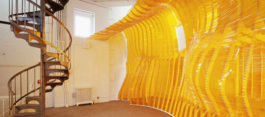
The horizontal wrinkles in the thin cloth over the windows held together by a fixture that allows it (the cloth) to take a wavy shape. The illusion of waves in addition to the horizontal lines creates a calm feeling. The bright orange yellow of the cloth with the sun’s rays pushing against it is very refreshing, welcoming, and happy. The spiral staircase, which may or may not be part of the exhibit, is so perfectly placed! Its hard NY feel creates its rough elegance, in contrast to the orange sheet. The fact that it’s spiral just makes it all the more desirable. (Because come on how many people do you know own one?!) The light that shines through the sheet rests on the staircase in a way that us illusive to a perfect sunset.
![Frida Kahlo. The Two Fridas. 1939 Oil on Canvas. —-somewhere in mexico city.There are two women sitting on one long bench, with not much distinction as to where exactly they are. We do see a very blue and cloudy sky in the background. The two women look almost identical in the face and posture. What really sticks out is the distinct unibrow on both women. Their up-did hair and facial structure look more masculine than women in art that i am used to seeing. They are angled slightly towards each other, with their dresses contrasting in color where their legs meet. The woman on the left is in a white gown with many layers and ruffled, lacy texture on top that flows into (what only looks and feels thinner because of reduced ruffles and layers) a thinner piece of skirt that is nicely embroidered with flowers on the trim. In this womans right hand she holds a pair of scissors that are attached to what at first appears to be just a line. As my eye examined that area, i noticed that what i thought were more flowers, were actually splotches of blood. That thin line lead me to her chest, where her heart and breast should be. A human heart is present where it should be within the human body on top of her flesh. Underneath it where i expected to see a more feminine chest, it is almost masculine and pectoral looking. The [now] arteries/veins of the heart are connected to the (also) exposed heart of the woman to the left of her. The woman on the right actually looks like she has a mustache. The primary almost analogous colors of her top dont look as elegant and pure in comparison to her other half. In her left hand she holds a spool, which also connects back to her heart. They are holding hands and staring blankly outwards. The painting gives off a feeling of opposites with the use of light and dark in the womens attire. The painting made me feel as though these two women were one person, just two different sides of her. The connection of the two hearts through just a thin line show that there is an association between them. Looking more closely at the hearts… it appears as though the artist has chosen to cut a heart in half, not down the middle like we may be used to seeing but through it. The Frida on the left has the part that would be closer to ones back (when positioned respectively) and the Frida on the right has the half that would be closer to ones chest.what i get from this painting is that there are two sides to Frida. one is more feminine and pure while the other is a little rougher around the edges, but they are still one being and very much in tune and respectful towards each other. it is symbolic for her to use the heart as where they connect, and how they connect. they arent attached at the hip, but at the heart- the center of your goals, love, life… etc. Anyone can relate to this piece because as humans we are complex creatures with different layers that make us who we are.not sure about those scissors and blood though…](http://25.media.tumblr.com/tumblr_meam7x5AZ01rmrw5vo1_400.jpg)
Frida Kahlo. The Two Fridas. 1939 Oil on Canvas. —-somewhere in mexico city.
There are two women sitting on one long bench, with not much distinction as to where exactly they are. We do see a very blue and cloudy sky in the background. The two women look almost identical in the face and posture. What really sticks out is the distinct unibrow on both women. Their up-did hair and facial structure look more masculine than women in art that i am used to seeing. They are angled slightly towards each other, with their dresses contrasting in color where their legs meet. The woman on the left is in a white gown with many layers and ruffled, lacy texture on top that flows into (what only looks and feels thinner because of reduced ruffles and layers) a thinner piece of skirt that is nicely embroidered with flowers on the trim. In this womans right hand she holds a pair of scissors that are attached to what at first appears to be just a line. As my eye examined that area, i noticed that what i thought were more flowers, were actually splotches of blood. That thin line lead me to her chest, where her heart and breast should be. A human heart is present where it should be within the human body on top of her flesh. Underneath it where i expected to see a more feminine chest, it is almost masculine and pectoral looking. The [now] arteries/veins of the heart are connected to the (also) exposed heart of the woman to the left of her. The woman on the right actually looks like she has a mustache. The primary almost analogous colors of her top dont look as elegant and pure in comparison to her other half. In her left hand she holds a spool, which also connects back to her heart. They are holding hands and staring blankly outwards. The painting gives off a feeling of opposites with the use of light and dark in the womens attire. The painting made me feel as though these two women were one person, just two different sides of her. The connection of the two hearts through just a thin line show that there is an association between them. Looking more closely at the hearts… it appears as though the artist has chosen to cut a heart in half, not down the middle like we may be used to seeing but through it. The Frida on the left has the part that would be closer to ones back (when positioned respectively) and the Frida on the right has the half that would be closer to ones chest.
what i get from this painting is that there are two sides to Frida. one is more feminine and pure while the other is a little rougher around the edges, but they are still one being and very much in tune and respectful towards each other. it is symbolic for her to use the heart as where they connect, and how they connect. they arent attached at the hip, but at the heart- the center of your goals, love, life… etc. Anyone can relate to this piece because as humans we are complex creatures with different layers that make us who we are.
not sure about those scissors and blood though…
![fromThe Twits. Roald Dahl, illustrator Quentin Blake.
Since I was young(er), i’ve always admired quentin blake’s simplicity and ability to capture emotion in a child like demeanor (which compliments roald dahl’s writing perfectly). Usually, blake creates very little background and focuses more on just the characters themselves. This particular drawing (i dont know for sure) but looks like it was done with pen and ink, and maybe some water color… or even some india ink with a brush. There is no color in this piece. Im not sure if that’s because the book is in black and white or if the artist intended it to be so. There is no distinction of a horizon, land, or even sky. Blake gives uses a diagonal birds eye view to show that Mrs. Twit is floating away… even more so amazing that he does this without even capturing the fact that she is attached to balloons. He uses the image of Mr. Twit looking up, and an exaggerated nose on Mrs. Twit to help develop that angle further. He doesnt pay attention the the proportion size of body parts or even the fact that his characters tend to look different throughout the book. (side note: i think thats one of my favorite things, because most artists who draw characters have almost set guidelines on how to draw them.) Blakes draws with short lines that seem almost unsure, short and choppy, scribbled even. The very little use of shading that is used doesnt have a wide scale. The shaded areas have pretty flat tones of watered down ink, some areas (like her dress) arent completely colored. I chose this particular drawing because it’s not all that aesthetically appealing. If i didnt know who quentin blake was and i were to sit down and produce a drawing that looked even relatively close to this, i’d crumple it up and throw it away. i’d think it was crappy, juvenile, not even worthy of the title of ‘sketch’. There is so much confidence in his ‘under developed’ (for lack of a better word) illustrations. like we learned in class, something in us as we grow up tells us that we need to be drawing more realistically and quentin blake’s style reverts back to the “complexity and realism” stage (age 7-10), but still has qualities of even prior stages like the scribbles. The fact that these drawings are right alongside text, make it more personal; almost like a sketch book… making his style… i dont know… more relate-able to?* more personal?* [*slide 9 from drawings: intimate and familiar]](http://25.media.tumblr.com/tumblr_meajevYrs71rmrw5vo1_500.jpg)
fromThe Twits. Roald Dahl, illustrator Quentin Blake.
Since I was young(er), i’ve always admired quentin blake’s simplicity
and ability to capture emotion in a child like demeanor (which
compliments roald dahl’s writing perfectly). Usually, blake creates very
little background and focuses more on just the characters themselves.
This particular drawing (i dont know for sure) but looks like it was
done with pen and ink, and maybe some water color… or even some india
ink with a brush. There is no color in this piece. Im not sure if
that’s because the book is in black and white or if the artist intended
it to be so. There is no distinction of a horizon, land, or even sky.
Blake gives uses a diagonal birds eye view to show that Mrs. Twit is
floating away… even more so amazing that he does this without even
capturing the fact that she is attached to balloons. He uses the image
of Mr. Twit looking up, and an exaggerated nose on Mrs. Twit to help
develop that angle further. He doesnt pay attention the the proportion
size of body parts or even the fact that his characters tend to look
different throughout the book. (side note: i think thats one of my
favorite things, because most artists who draw characters have almost
set guidelines on how to draw them.) Blakes draws with short lines that
seem almost unsure, short and choppy, scribbled even. The very little
use of shading that is used doesnt have a wide scale. The shaded areas
have pretty flat tones of watered down ink, some areas (like her dress)
arent completely colored. I chose this particular drawing because it’s
not all that aesthetically appealing. If i didnt know who quentin blake
was and i were to sit down and produce a drawing that looked even
relatively close to this, i’d crumple it up and throw it away. i’d
think it was crappy, juvenile, not even worthy of the title of
‘sketch’. There is so much confidence in his ‘under developed’ (for
lack of a better word) illustrations. like we learned in class,
something in us as we grow up tells us that we need to be drawing more
realistically and quentin blake’s style reverts back to the “complexity
and realism” stage (age 7-10), but still has qualities of even prior
stages like the scribbles. The fact that these drawings are right
alongside text, make it more personal; almost like a sketch book… making
his style… i dont know… more relate-able to?* more personal?*
[*slide 9 from drawings: intimate and familiar]
[*slide 9 from drawings: intimate and familiar]

The Starry Nightby Vincent Van Gogh
the impasto stylistic quality of the work give it a sense of unity. tying into that are his choice of colors. influenced by impressionists and neo-impressionists, the use of analogous colors swirl into each other causing the eye to move across the painting in a manner than flows with the brush strokes. the movement created by the brush strokes suggested lines gives us a sense of the movement of the air/wind being captured in the painting. The black figure (which i hear are trees o.O) to the left of the painting, occupy about 1/3 of the canvas (vertically). The distinction between land and sky also roughly occupy 1/3 of the canvas (horizontally). Aside from the repetition of dots and swirls, (which is more style related that composition related to me…) there is a repetition of exaggerated illuminating stars across the sky. The stars vary in size, with no real distinction of what is at the center of the circular figures… while the centers of them all appear to be just about the same size. i think that he does that to show that some stars, regardless of size, just shine brighter than others. Being that it is a landscape, i would say it is balanced… however, i think it important to really notice how important the ‘tree’ is to balancing the painting. *place your hand over it* Without it, i feel like the piece has more chaos, less direction. For me, my eye first focuses on the large black vertical figure first and thenit is carred (through the use of color, line, and style) across the painting like a book. The ‘tree’ gives the painting depth. It is the closest image to us and allows the view to feel higher than the town, as if on a hill looking down at it.
the impasto stylistic quality of the work give it a sense of unity. tying into that are his choice of colors. influenced by impressionists and neo-impressionists, the use of analogous colors swirl into each other causing the eye to move across the painting in a manner than flows with the brush strokes. the movement created by the brush strokes suggested lines gives us a sense of the movement of the air/wind being captured in the painting. The black figure (which i hear are trees o.O) to the left of the painting, occupy about 1/3 of the canvas (vertically). The distinction between land and sky also roughly occupy 1/3 of the canvas (horizontally). Aside from the repetition of dots and swirls, (which is more style related that composition related to me…) there is a repetition of exaggerated illuminating stars across the sky. The stars vary in size, with no real distinction of what is at the center of the circular figures… while the centers of them all appear to be just about the same size. i think that he does that to show that some stars, regardless of size, just shine brighter than others. Being that it is a landscape, i would say it is balanced… however, i think it important to really notice how important the ‘tree’ is to balancing the painting. *place your hand over it* Without it, i feel like the piece has more chaos, less direction. For me, my eye first focuses on the large black vertical figure first and thenit is carred (through the use of color, line, and style) across the painting like a book. The ‘tree’ gives the painting depth. It is the closest image to us and allows the view to feel higher than the town, as if on a hill looking down at it.
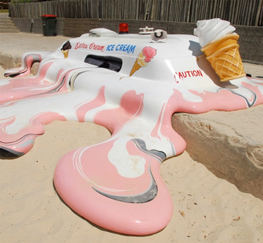
Melting Ice Cream Truck by The Glue Society
this sculpture is ironic and funny because ice cream is a frozen desert, often associated with Mr. Softee or other ice cream truck franchises. To see a truck so close to a beach, plays with one’s word association. When you think of ice cream, you think of relief from the heat- COLD. To see a truck melted into the ground, gives the opposite feeling of relief; you almost feel the heat ten fold.
The way the artist uses line in this three dimensional work through color. We know what a vanilla cone with rainbow sprinkles looks like when it melts; the swirls of pinks and whites, mixed together with the grey enhance the understanding that the truck has indeed melted. The curves of the line suggest slow outward movement, much like the edges of a puddle would do when expanding. The asymmetrical lines and organic flow to the overall shape of the piece, make it’s melting process look so natural- very true to life. The truck itself, looks as though it were a real ice cream truck- even in size: lights, megaphone, window, giant soft-served ice cream cone… all there. Being that the work is three dimensional, the natural light source that hits it only gives it true to life shadows. The light also plays its part in making the work look real by its reflection off the melted section. Its shine gives it a liquid feel. If you take a closer look at the window, depth in implied through shades of grey. There are mostly secondary or tertiary colors used, being that ice cream has more of a pastel feel to it. We only see use of primary colors in the lettering on the truck and the red siren light on top. The majority of the piece is smooth aside from the ridges used in the cone.
creating content
No comments:
Post a Comment